Exploring Space Through a Figure; Drawing Family Members, and a look at the work of John Wonnacott

John Wonnacott

Wonnacott was born 1940, London, England) is a British painter. He trained at the Slade School of Fine Art during 1958–63.

These two compositions are interesting; the compositions work, despite elements being cropped, due to the figures being the central focus in the pieces. Notably, the artist has included many angles these pieces, those from the the ceiling, the carpets, the walls, the windows. The chair also is at a different angle from both figures. All these contrasting lines build up a sense of space and a little commotion and provide the eye with lots to look at. I notice too, that both pieces have been subtly drawn and painted darker in areas in order to make elements feel closer, which builds on the sense of space within the pieces.

Here it’s the sky that really creates a sense of space as the clouds draw outwards towards the edges of the piece, in opposite directions to the table and chairs and the leg of the character on the right. The effect of these elements draws the eye to the little path right in the centre of the drawing. Interestingly it’s hard to grasp the exact perspective the artist paints in as he seems to combine a few; in some areas of elements are painted as though he’s looking upwards at his subjects, while some areas – like the shoe under the table, are painted from above and the boy on the left’s head and the tree trunk are painted as though the artist is looking straight ahead, I believe this is what makes the painting so striking.

I like that Wonnacott cleverly explores reflections in this piece to advertise a sens of space, and how he paints them in different shades, playing with light sources. Also, different to many portraits, it’s the hand holding the glass, followed by the subject’s hand on the right that captures my attention, as opposed to the face, they’re bold and hint at the character of the man; they suggest to me, that he works hard, yet tends to be a little tense, he seems like a bold man.

The marks across the floor in both of these pieces lead the eye into the figures of the painting and create, especially in the painting, a perception of movement. Both pieces combine curved lines with straight, which prevents them from appearing too rigid and simulates the imperfections of man made surroundings. The curved lines also exaggerate the oddities of the subjects within the pieces.

Drawing Friend’s/ Family Members

Below are examples of some quick studies of my friend Thorin, and my Grandma that i made in my sketchbook before moving on and attempting some more finalised versions. Drawing in my sketchbook first, enabled me to grasp the subjects I was drawing and draw more definitely when it came to the more finalised versions. While I drew I kept in mind aspects of Wonnacott’s drawing’s and paintings that I’d admired. For example I tried to ensure there was a central focus to each drawing and I tried to darken the lines that I wanted to appear closer. I found it more enjoyable drawing Thorin as his dreaded hair is so interesting, and I was able to draw by building up layers of shadow. I also found hom enmjoyable to draw for he was sat in my room and so the objects and furniture are things I love and therefor drew with passion. However, I also enjoyed drawing aspects of my grandma and her room- particularily her figure though, as she has curves and interesting, hands that show she’s worked hard throughout her life.

Below are two pieces I spent more time on.

I like some parts of the first, such as the wispy curtains as they do seem to carry weight as though they’re hanging, and the way the elbow indents the cushion. I also like the composition; the way the hand gently rests on her cheek. However, I’d say overall, the piece lacks vigour and could have been drawn with more energy- I expect this would come the more I practice drawing figures.
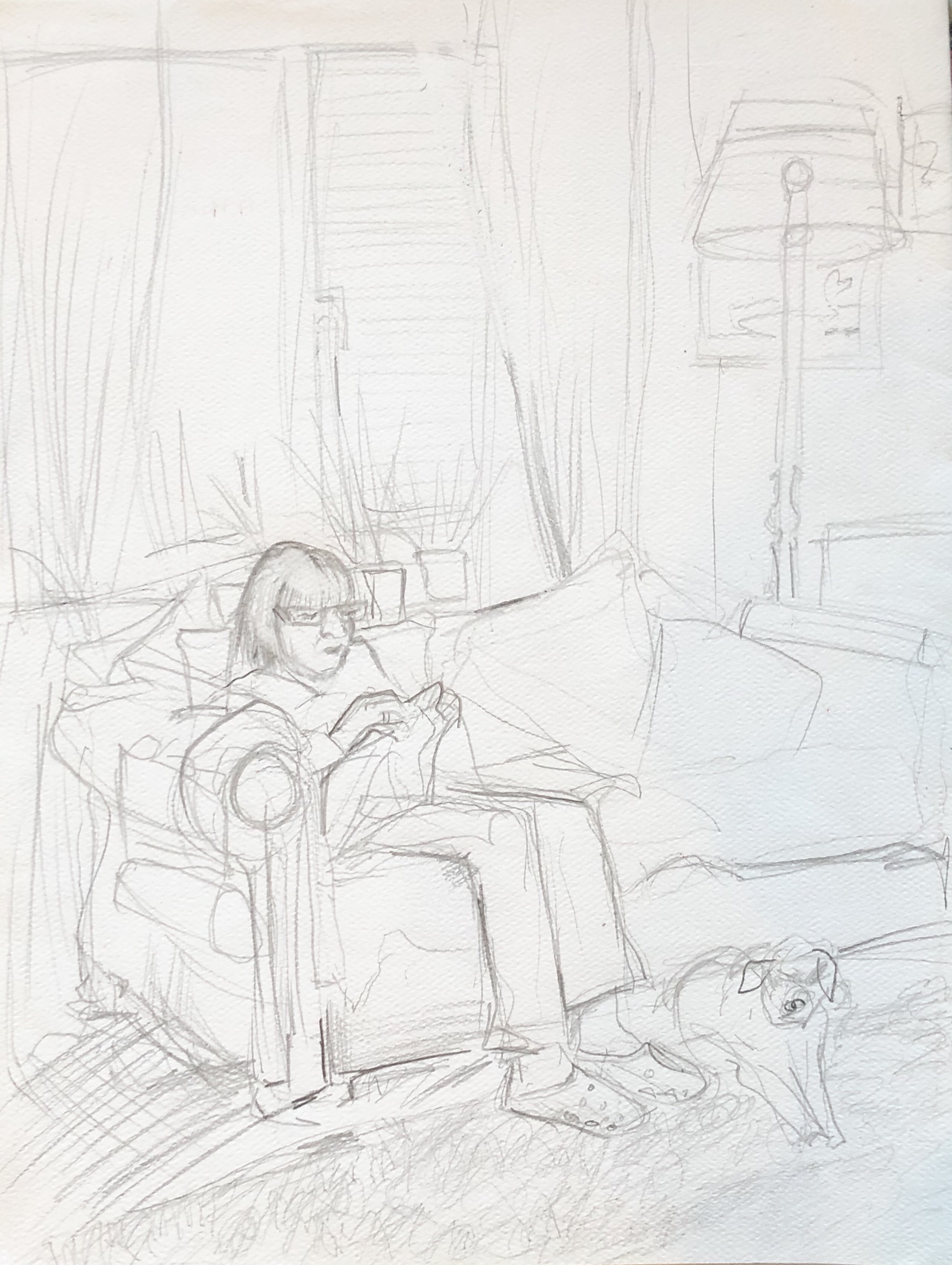
This piece is a little less stagnant than the other and also displays more of a sense of space. I drew this looking up from the floor at my grandma, which is more of an interesting composition than the previous one, which was drawn from looking straight ahead. I attempted in both pieces, to darken the foreground in order to really bring it forth. I’d say the darkened foreground is more apparent in this second piece but both could do with it darkening even more. Perhaps I will get the opportunity to work into them in my next drawing class, as I feel this would greatly improve them and create a more vivid sense of space.

‘Inside/outside’ – Shadow Trapunto & Applique

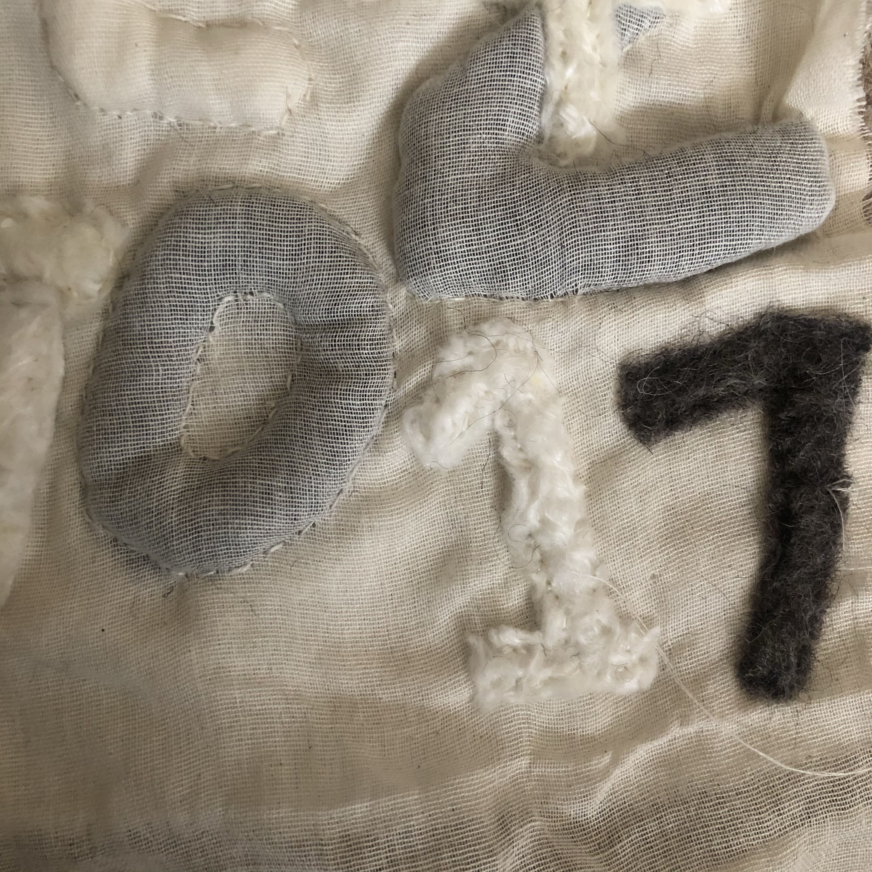
For this lesson I cut out number and letters from the plain felted sheets that I’d created in my Wet Wool Felting class, and used these to create another piece demonstrating shadow trapunto and applique.

The piece consists of two pieces of material, muslin for the top layer and calico for the bottom. For the trapunto method, I ‘trapped’ some felt numbers between the two piece of material and sew neatly around the trapped number using running stitch. It helped to pin down the fabric and the felted numbers/ letters and to use an embroidery hoop, to save the fabric from moving about and to keep it taught.

The numbers/ letters that lay on top of both pieces of material are examples of the applique method. I sew along the edges of each number/ letter, also using a running stitch.

My Trapunto and Applique Composition

I thought carefully about the positioning of the numbers and letters. I layered the ‘4’ over the ‘2’ in an attempt to make the piece more interesting. I’d say it certainly does make the piece more intriguing but it perhaps breaks the ‘2’ a little too much.

I quite enjoyed the process overall as it was satisfying to watching the surface being raised, however, I found it hard to pick up a rhythm in my stitching and so it took me quite a bit of time.

A Second Attempt at a Trapunto and Applique Composition

I found this piece quite challenging for the felt was thick and therefore it was hard to mimic the delicacy and elegance of seed heads that I so desired, overall I’m not too pleased with it. However, I must give myself credits for the effort- especially seen as the white felt I used began to come apart as a sew (this time I used a batch of felt made by a class mate and it wasn’t as solid as the one I made and used for my previous trapunto piece).I had aimed to create delicate, thin stalks but due to the felt fraying this way I couldn’t achieve that. I’m not too disappointed with them though, as it is quite a nice effect, and I imagine it’d work well in creating dandelion heads.

Wet Wool Felting and Inspiring Artists who use Felting in their Practice

Todays textile lesson was based on wet wool felting. I vaguely remember having a go at it around my Grandma’s table when I was younger and I am familiar with needle felting as my mum and I used to make ‘magic wool fairies’ with needles around the fire in winter.

I enjoyed the process of wet wool felting, although it was tedious rolling the wool for lengthily periods of time.

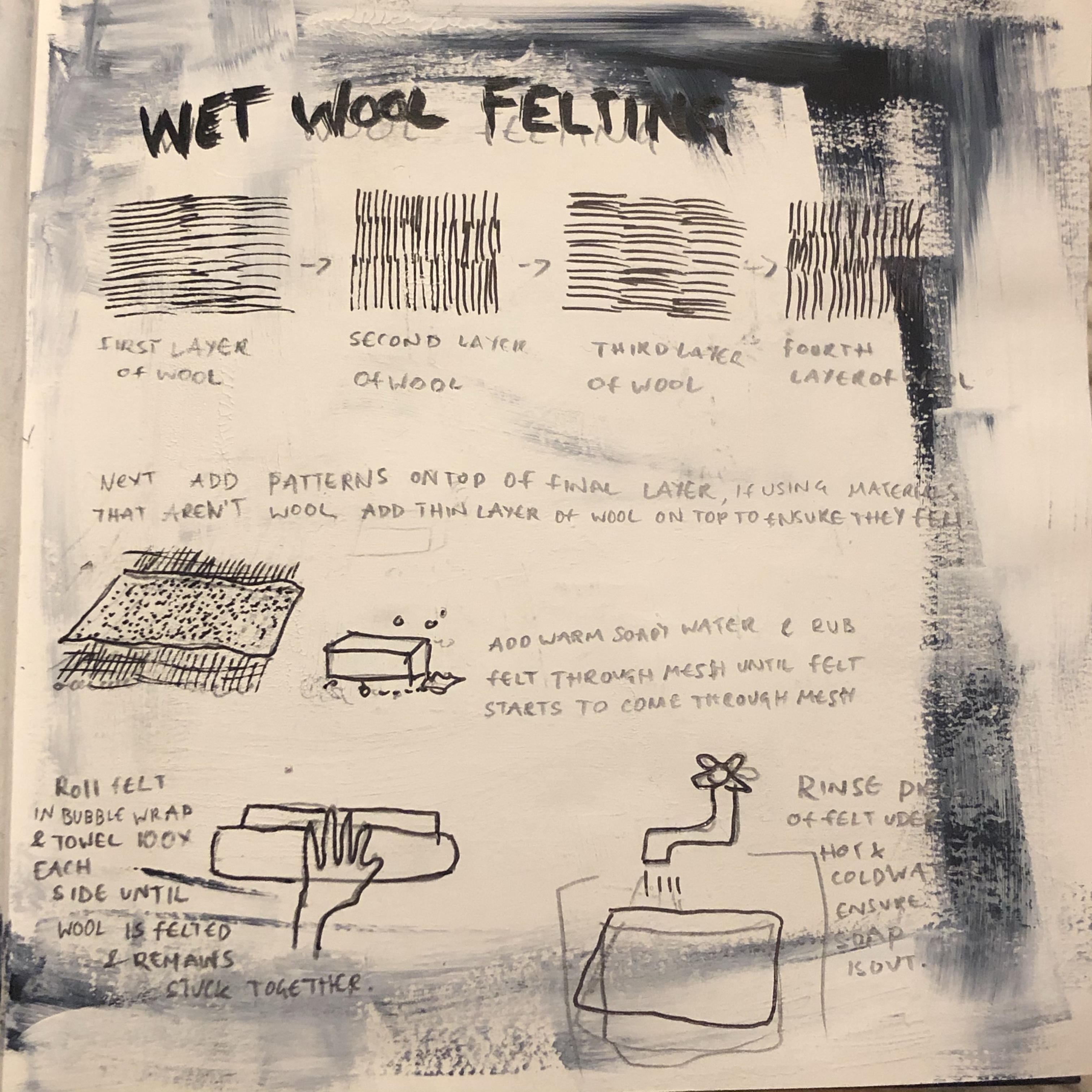
Below, I have attached an image from my sketchbook where I have explained the process of wet wool felting:

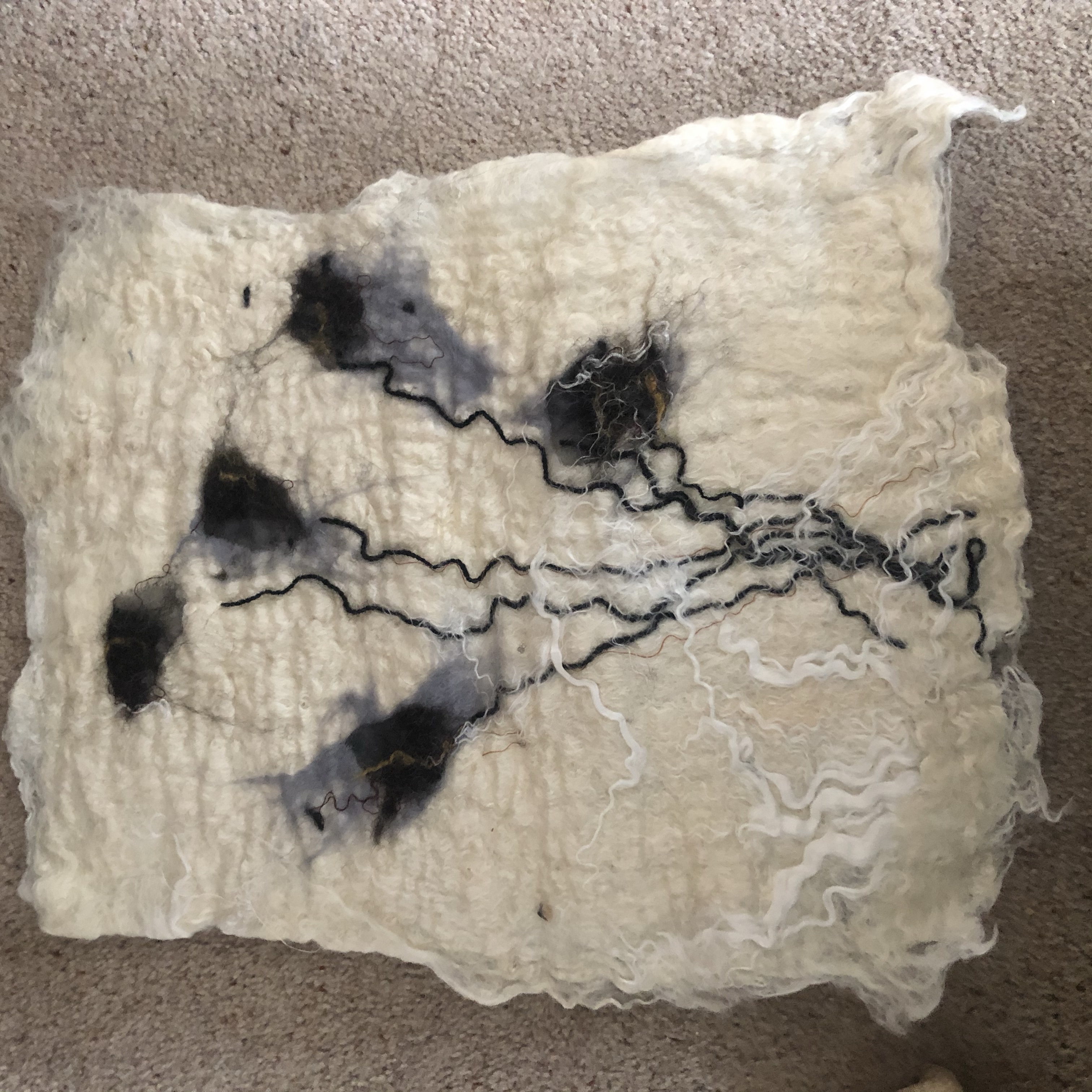
Wet Wool Felted Composition based on seed heads.

I made two sheets of plain felt, one a natural white and then one grey, ready to use for a task next lesson. These were quite thick as they were formed from 4 layers of wool. I then made a patterned piece based on my illustrations of seed heads. The patterned version is made using the same process as the blank pieces, only just before placing the mesh over the wool and adding warm soapy water, I placed some materials and bits of coloured wool on the layered pieces of wool. In order to ensure the bits of material and string etc. stick, and felt along with the wool, very fine layers of wool must be layered over the material.

close up of my felted composition

As it was my first attempt at creating a wet wool felted composition, I wasn’t sure how the materials would look once they’d been rolled and felted and so I just went ahead and experimented. I’m not so fond of how the finish piece looks as I’d like it to have a little more definition, I will perhaps work into it with stitch to refine it a little more. I am however more familiar in working with felt, and now know what to expect a little more and so it was a useful experiment.

Artists who use felting in their practice

Joe Neil

Jo Neil, a felt maker based in North West England, takes her inspiration from everyday ‘mundane’ objects with an interest in our relationship to them, how we use and view them. ‘Felt like it’ was started up in 2008 as a label for Jo’s original designs that use feltmaking, stitch and fine art technique. The first piecec I’ve chosen of her’s, drew my attention for it’s monochrome patterns appear to be piled and tangles- a nice effect that I would hve never thught to epermient with. As she uses a monochrome palet for this piece it ppears stright forward and it’s easy to distingiush the felt and it’s patters despite being a complicated design. The second piece by her, that I’ve chosen, featuring a rather abstract figure interested me for i like the way the artist has created a muffled, soft coloured backgroundto contrast the intricately stitched red clown. As the background is quite ubtle the artists is able to use fine stitch which creates delicacy within her piece.

Moy Mackey


Moy Mackay works from her home in the Scottish Borders, and she fuels her passion for colour and texture through inspiration drawn from her surroundings. She uses merino fleece fibres in the same way that a painter uses brushstrokes which creates “felt paintings” of stunning warmth and texture. Her pieces are striking as she dapples them with vibrant colures which immediately catch the eye and I notice the felt imitates and slightly exaggerates the waves and slopes and curvatures of nature perfectly, giving each piece character. I’m particularly drawn to the piece featuring two little houses, as the background blue is so vibrant and despite the it covering most of the piece it refrains from washing the other elements out for she dapples blue in the bottom half of the piece to balance the image. What’s more the blue is lies by an almost equally strong ochre colour. The careful black outlines lend the piece refinement and pull the simple elements together and form detail.
Andrea Hunton

The way the artists uses the felt here, exemplifies the flowing strands of hair and grass and clouds and creates a striking sense of the wind.

Andrea Hunton’s felt piece’s caught my attention for she creates a sense of space within her work by creating strong foregrounds, middle grounds and backgrounds. As I look at them I feel as though I’m sucked in by the flowing strands of felt and it’s difficult to look away. The artist uses mixtures of strands of colours in her elements which lend a realistic effect. As her pieces feature dark toned colours, her work exposes a raw mellow atmosphere that I relate to, found in nature.

Raising the surface, hand stitch

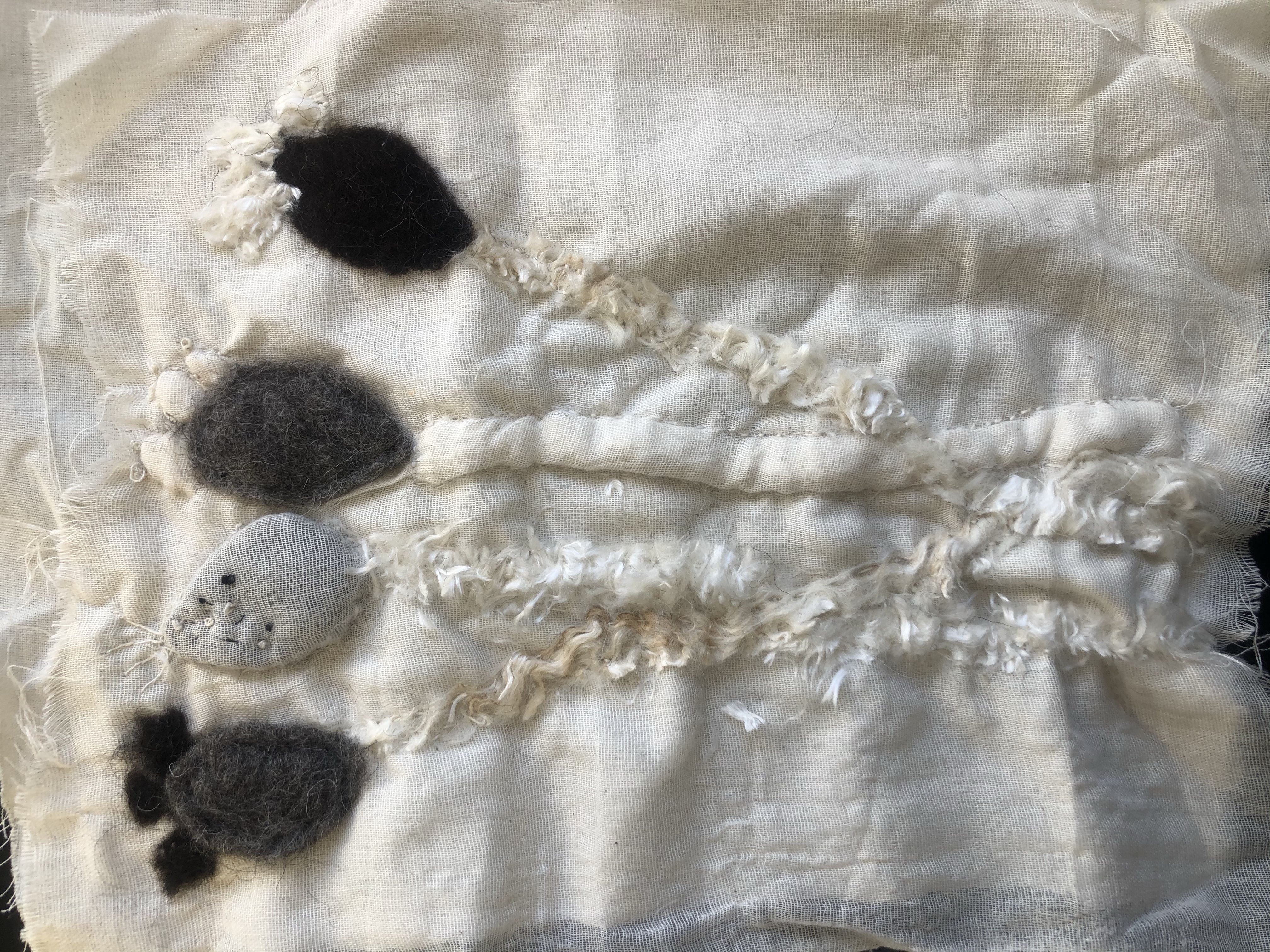
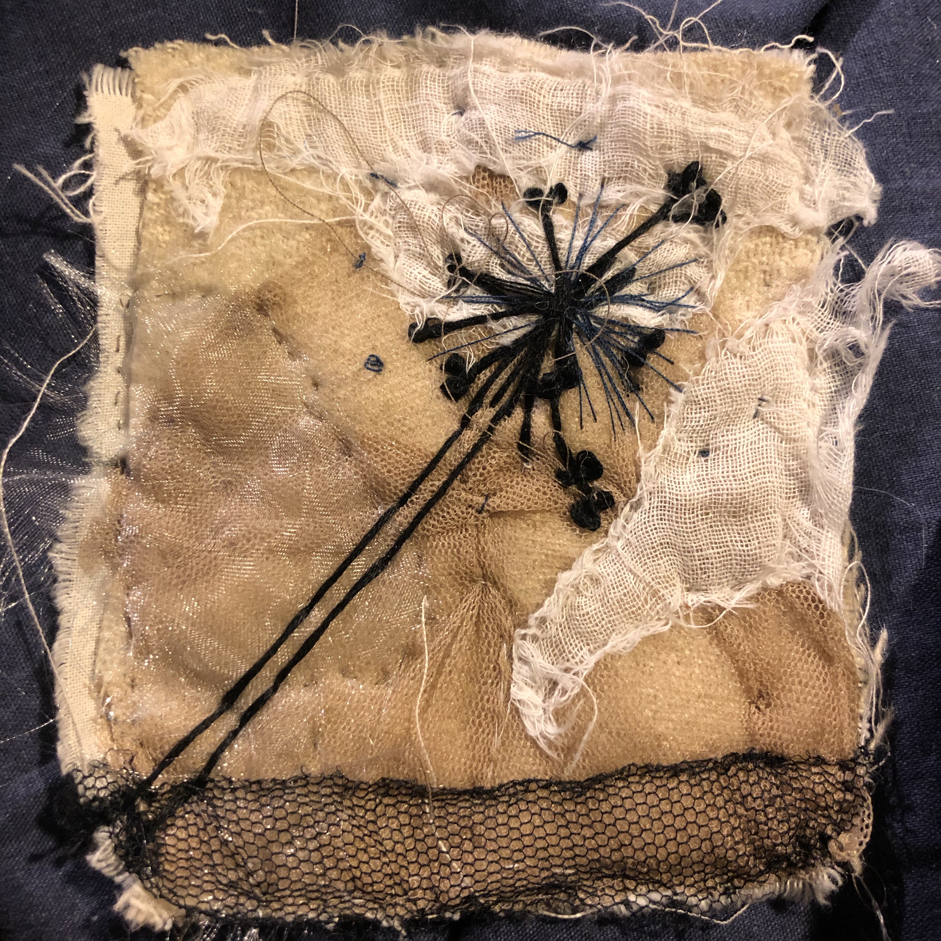
This has been my favourite exploration within textiles so far as I really got to play with stitch and material, and discovered new ways of working with it. I pushed myself to used all my newly gained knowledge of stitch within these and I think it’s shown as each displays aspects of delicacy and detail. I thought carefully about the positioning of each piece of material as I believe having a strong background plays an integral part in ensuring the embroidery work stands out.

The embroidery is based on my illustrations of the seed heads from a couple of weeks ago. I initially used one type of thread across each piece but I went back in with a second round of thread as I felt they looked a little simple and drowned in the material. The second round of thread most definitely brought the pieces to life as it added that little extra bit of definition and pulled the pieces together.

The background layers of materials were sewn on carefully in running stitch, with matching coloured thread to ensure they blend together smoothly.

I used a threaded running stitch for the stems of these embroidered seed heads and I’d say this is what brings forth the piece as it lays higher above the surface than any of the other materials. The background material has been placed carefully in different angles to make it slightly geometric and the flash of blue and pearly white silk adds just a little more excitement to the composition, which is carefully balanced alongside the subtle mesh.

I am fond of the background on this one as the colours and the airy appearance of the wool and the shimmer of the fabrics has a gives of a dreamy sensation. The background fabric is vertical and heads in one in one direction, which is balanced by the curvature of the seed head. I realise the embroidery looks quite timid. On one hand I would like to go and embroider more over parts to bolden it a little but on the other, I like its fragility and so I left it this way .

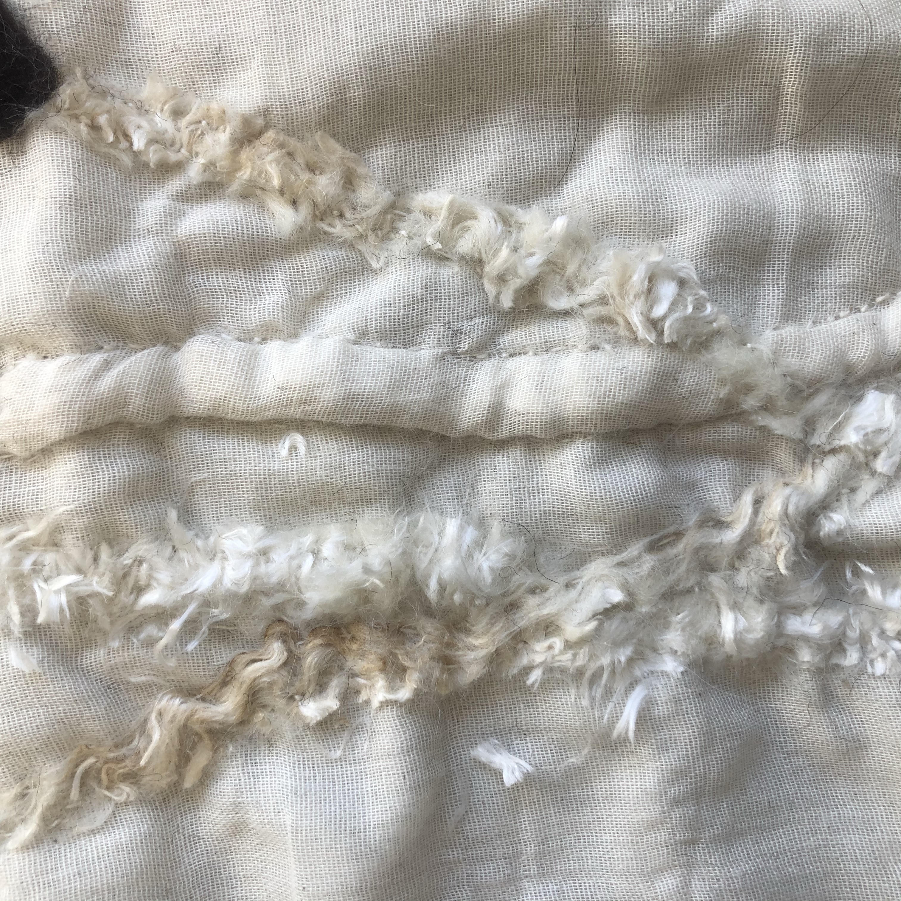
This is probably my least favourite piece for it looks, in my opinion a little cliche and the black embroidery thread is a little too thick and therefor looks a little clumsy. However, I like the effect I created with the muslin in background, it looks ruffled and frayed, yet it’s solid which I created through making some bits if the fabric more tort than others when as I sewed.

Overall, despite the process of raising the surface and hand stitchbeing so lengthly, I enjoyed this much more than I imagined I would at first, and relaxing. This task has left me feeling positive towards similar exploration in textiles to come.

The History of Embroidery and Hand Stitch in the Household

The word embroidery comes from the French word broderie meaning embellishment.

Embroidery is the decoration of fabric or other materials using a needle, thread or yarn. Other materials such as pearls, bead, quills, and sequins are also used for embroidery.

The use of embroidery to decorate clothes has been around since man began to wear clothes. Embroidery arose when man discovered that thread could be used to join pieces of fur to make clothes. This led to that same thread being used to make decorative patterns on the clothes. Embroidered designs were developed as a result of hard work and care and embroidery as an art form can be traced back to the Iron Age.

Costume Embroidery

The material used in making historical costumes varies across the world. Wool, linen, and silk have been used for embroidery for many years.

Costume embroidery dates back to 30000 BC or the Cro- magnon days. Fossilized remains of hand stitched and decorated clothes, boots, and hats have been found archaeologists.

In Siberia around the year, 5000-6000BC drilled shells stitched with decorative designs were discovered. In China embroidery dates to 3500BC and there are pictures that show embroidered clothing with a silk thread, stones, and pearls. In China, an example of chain stitch embroidery was found in warring streets between 3rd -5th Century BC.

Detail of an embroidered silk gauze ritual garment from a 4th-century BC, Zhou era tomb at Mashan, Hubei province, China. Rows of even, round chain-stitches are used both for outline and to fill in color.

Application Techniques and Materials Used in Ancient Times

Around year 1000, the development of embroidery in Europe took off. In this period the Christian church grew and royalty gained power in many countries. To demonstrate their power and wealth, richly decorated garments and ornaments in the form of wall hangings and tablecloths were commissioned.

One of the world’s most famous works of embroidery is The Bayeux tapestry depicting the Norman conquest of England in 1066, a product of this period.

See the source image
The tapestry measures 70 m x 50 cm, is embroidered with stem stitch and double couching on unbleached linen and is thought to have been embroidered in 1076.

In the 1200s to 1300s all types of clothes including male attires include embroidery. In 1500 A.D embroidery was considered luxurious in Europe and other areas in the world. From 1500-1700 thread and embroidery became more famous. embroidered beads were found on layettes, baskets, court dress, home furnishing, and many other items.

In Persia, India, China, Japan, Byzantium, medieval, baroque Europe and other cultures embroidered clothing, religious objects, and other household items were a sign of wealth. In different cultures, traditional embroidery techniques were passed from one generation to another, especially amongst cultures such as Vietnam, Mexico, eastern Europe. In England, there were professional workshops, and guilds began in the Medieval period. The outputs of the workshops were known as English work or Anglicanism and it was famous throughout Europe.

Goldwork

Goldwork embroidery is one of the oldest English embroidery techniques with records dating from before the 10th century.

it was mostly worked through churches and specially trained groups and was classed as a great art because of its fine art concept and historical properties. It reserved for the higher classes and those rich enough to employ these artistic embroiderers.

The goldwork threads used to be pure gold and were flattened and wound around strands of animal and human hair. Later because the gold was so brittle, they were wrapped around materials such as silk, animal gut, paper, or parchment. During early days this was all done by hand, which made the cost phenomenal. The most renowned examples of English embroidery are the beautifully preserved St Cuthberts Stole and maniple which was made at the behest of Queen Aelfflaed about 901AD, it is covered completely in gold laid work and couched thread, it is displayed in Durham Cathedral.

See the source image

TAPESTRY

What we today call tapestry originated around the year 1800, when it became popular among women in upper-class environments to embroider small images. These were often oriental motifs featuring plants and flowers and were inspired by the goods brought back to the West by the East India Company.

EMBROIDERY IN THE MODERN WORLD

Around the year 1900 embroidery had spread from being the preserve of the upper-class and became a pastime of the people. Mail order catalogues and pattern papers led to patterns and techniques being widely spread, and embroidery was no longer executed on expensive silk but on coarser and cheaper materials. Most hangings now also featured a short text in the form of proverbs, sayings or scriptures in combination with a pattern that formed the frame.

HISTORY OF HOUSEHOLD SEWING

Before sewing machines were invented, all sewing was done by hand. The first functional sewing machine was invented by the French tailor, Barthelemy Thimonnier, in 1830. Thimonnier’s machine used only one thread and a hooked needle that made the same chain stitch used in embroidery. In order to save money, many women would sew and mend clothing for their family. It could take up to 10 hours to make one dress alone.

After a variety of different versions of sewing machines were introduced but in 1850 Isaac Merritt Singer set out to design a machine that combined all the best elements . While sewing machines were initially sold to clothing manufacturers, they became common place in many homes as they became more affordable and hand sewing became muvh less common.

The industrial revolution then created a shift toward factory produced fabric and clothing. The invention of the domestic sewing machine allowed women to create clothing in far less time and automated looms made fabric more affordable. As ready-to-wear clothing has become more popular and inexpensive, sewing has become less of a necessity and more of a leisurely pastime for most people.

Nowadays, it is considerably cheaper to buy ready made clothes than to make your own as cloth is expensive. Sewing in the household is a rarity these days, with people only usually making their own clothes for leisure, as opposed to back in my grandmas day when they made clothes, as it was cheaper- even when my mother was younger around the 70s, my grandma would make her clothes. Our generation now barely know how to mend holes in their clothes as people tend to throw away old clothes and buy new ones. The quality of cloth is also much poorer nowadays, most of what we wear now tends to be made from synthetic fibres which doesn’t last as long nor mend as well as naturally fibered cloth such as cotton or wool. Sadly, as quality has decreased people these days no longer cherish nor mend their clothes with as they once did, even back when my grandma was young in the 1940’s.

Second Day in the Life Room and Some Inspirational Artists

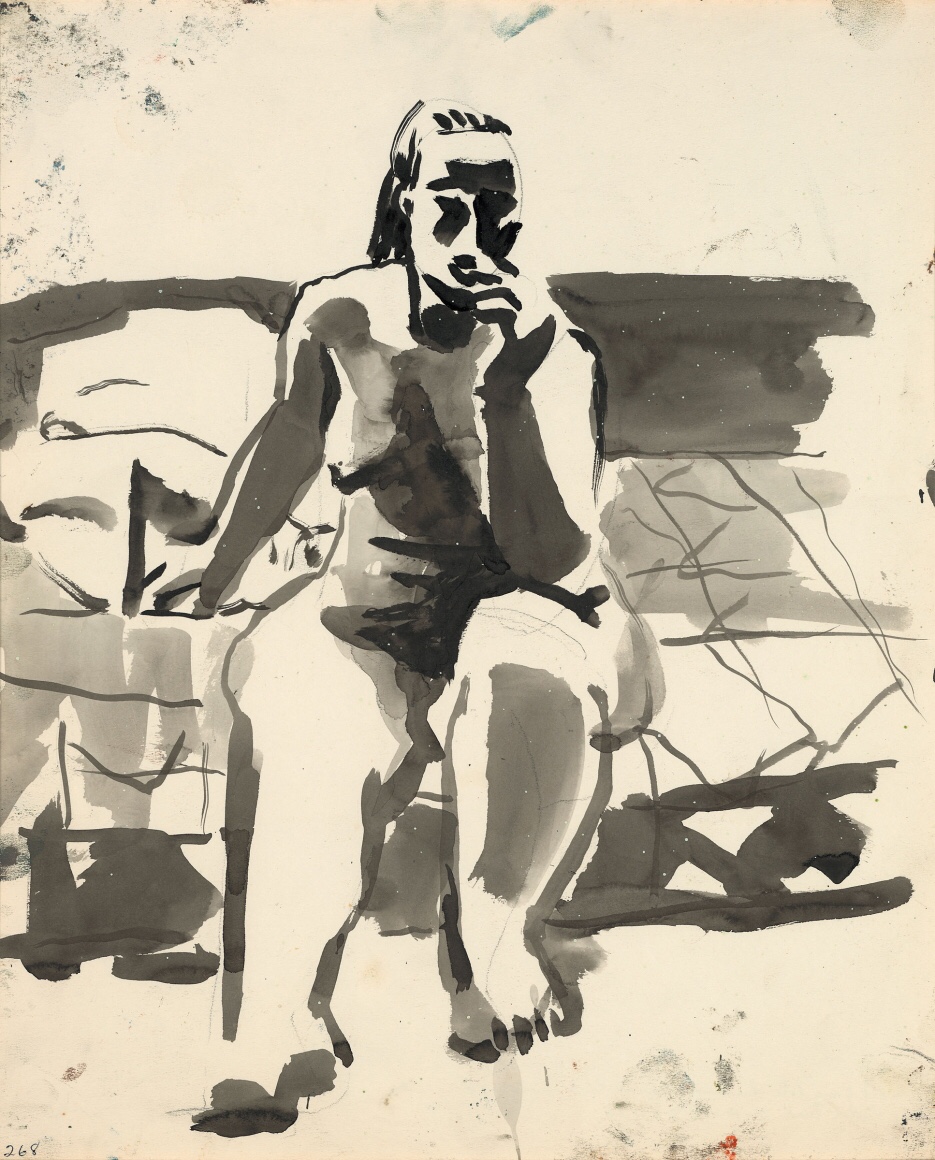
Richard Diebenkorn


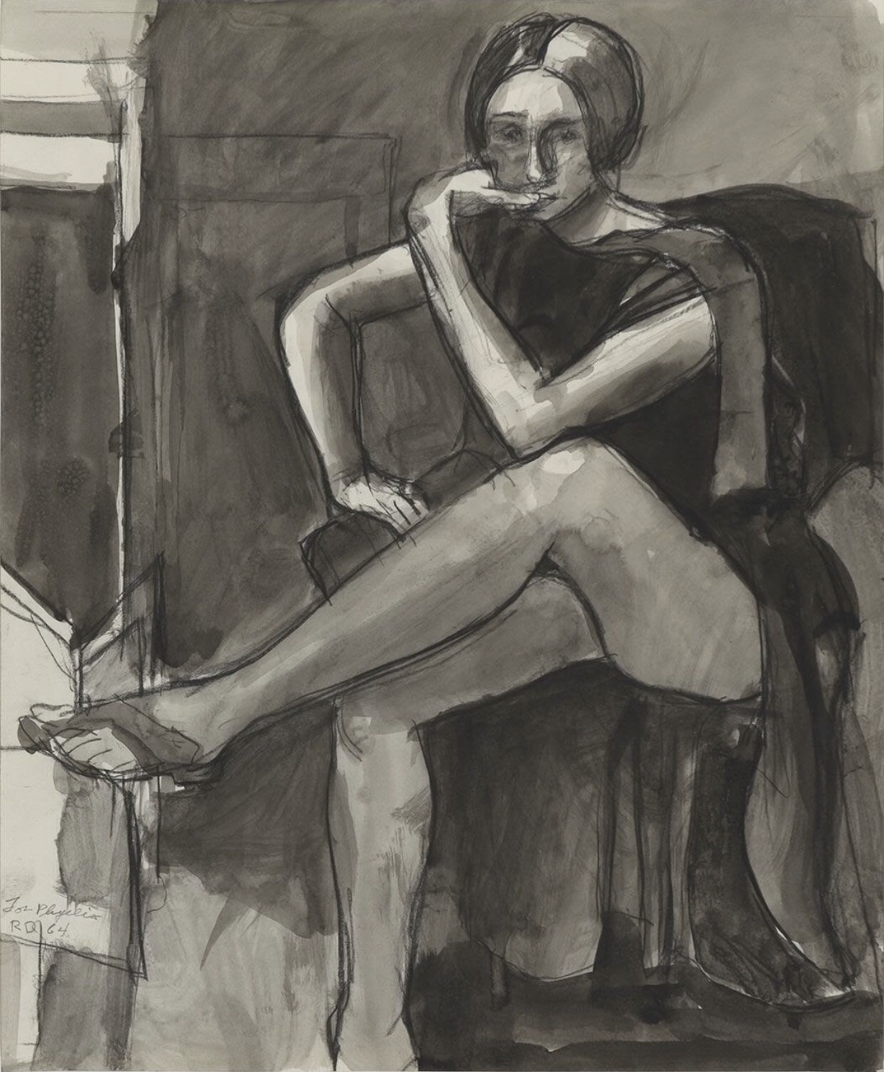
I notice that Richard Diebenkorn works into his background with lively strokes , which really accentuates the figure and brings the piece to life. The range of tones also adds to this, and the darkened areas refine the drawing. He appears to paint rapidly, which ensures the painting looks fluid, a quality I wish to ensure my paintings have. I especially like the way Diebenkorn uses bold, and in some areas, drippy, expressive, lines for of the figures as they describe character and human imperfections.

David Park

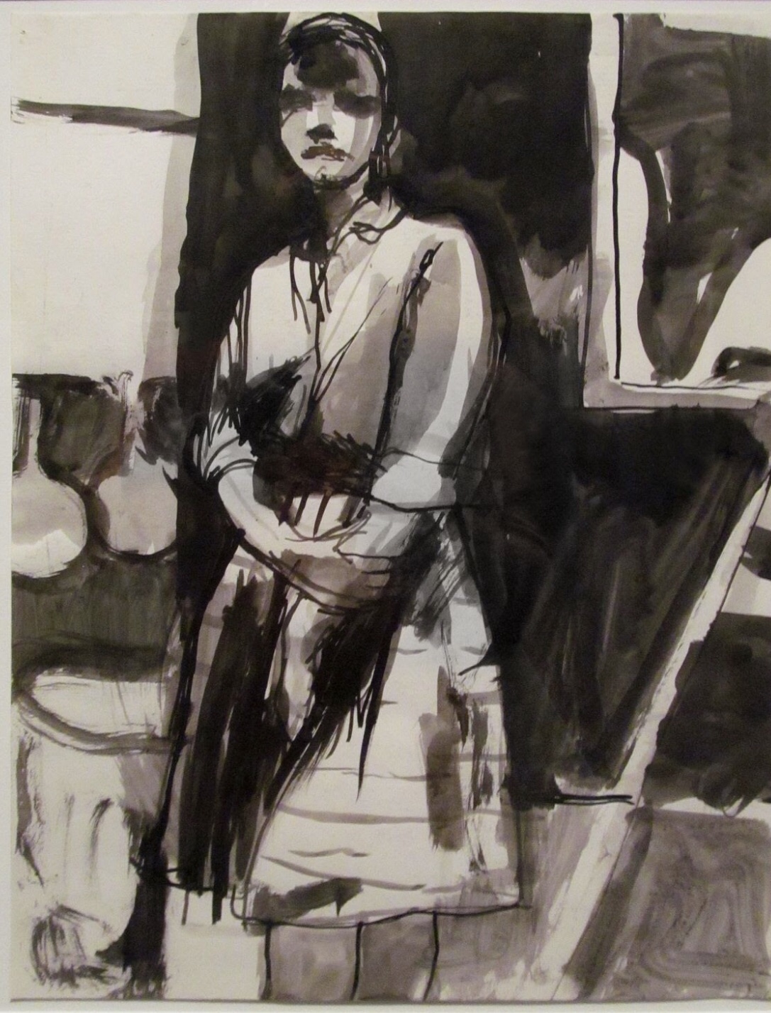
David Park, whose figurative work is similar in some senses, to Diebenkorn’s, is another painter I like. Much like Diebenkorn, he describes light through using different shades of black wash, and his paintings are loose. I like the silhouette aspects as they ensure the figure stands out while lending a sense of mystery. The figures are in correct proportion and so the artist is able to play with some features like the feet in a more expressive way while maintaining realism throughout.

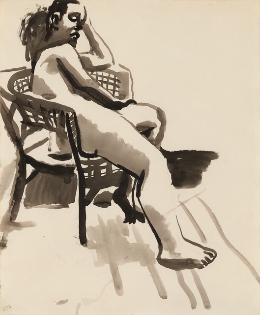
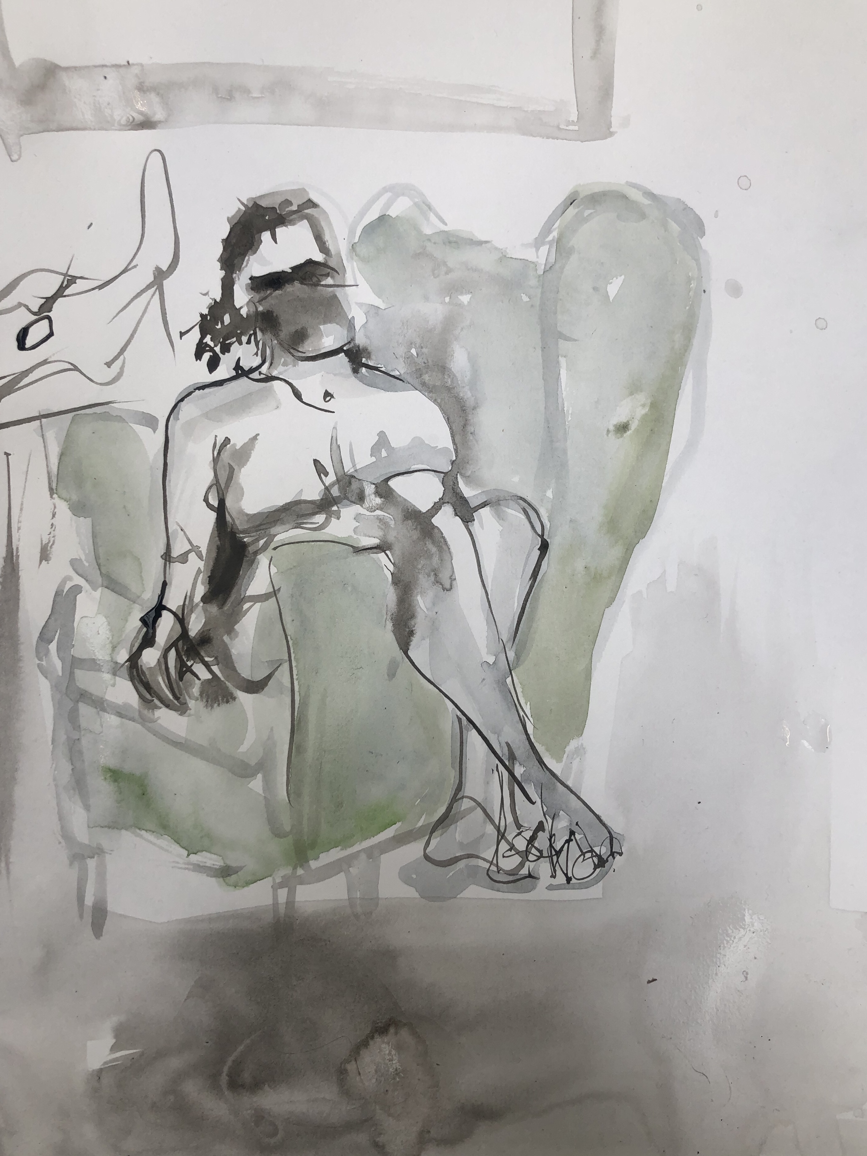
This week I made some looser studies of the life model, using charcoal, inks, watercolours and pencil. I liked working this way as I felt I was able to achieve more life in my drawing. I discovered that drawing precisely the week before had improved my eye for this session, for although I was being loose, I still drew with precision and so the proportions in my drawings are fairly accurate. It was enjoyable to use a wash as it enabled me to work into the background and emphasise the figure.

Life Study using pencil, charcoal and ink wash

This was my first attempt and so appears a lot tighter than those that follow, where I began to loosen up in my strokes a lot more. i would say the the chair brings this drawing together as it is drawn bold and accurately. The figure is drawn pretty well but I’ve made her look to rigid, she isn’t sunk into the chair enough which makes her look a little awkward.

Life Study using charcoal, watercolour and ink wash

I let myself go while creating this drawing and it shows through my easy strokes. I’m pleased with the result, I fear if I work into it further I’ll ruin it’s nonchalance. The shadow behind the chair was inspired by the way Diebekorn emphasises his figures with dark areas.

Life Study using ink washes and watercolour

This was my quickest drawing and as it was my third attempt I drew using a brush instead of sketching the shapes first with charcoal or pencil like I did the last two. By going straight in with a brush I’ve created a more abstract drawing, I like both ways of working, butthis way is certainly a more playful and I discover I work with accidents which can create interesting effects.

I am pleased with these drawings and I’d love to do more of these as drawing this way improves my confidence and I find new subtle ways of drawing when I explore subjects loosely and quickly like this.


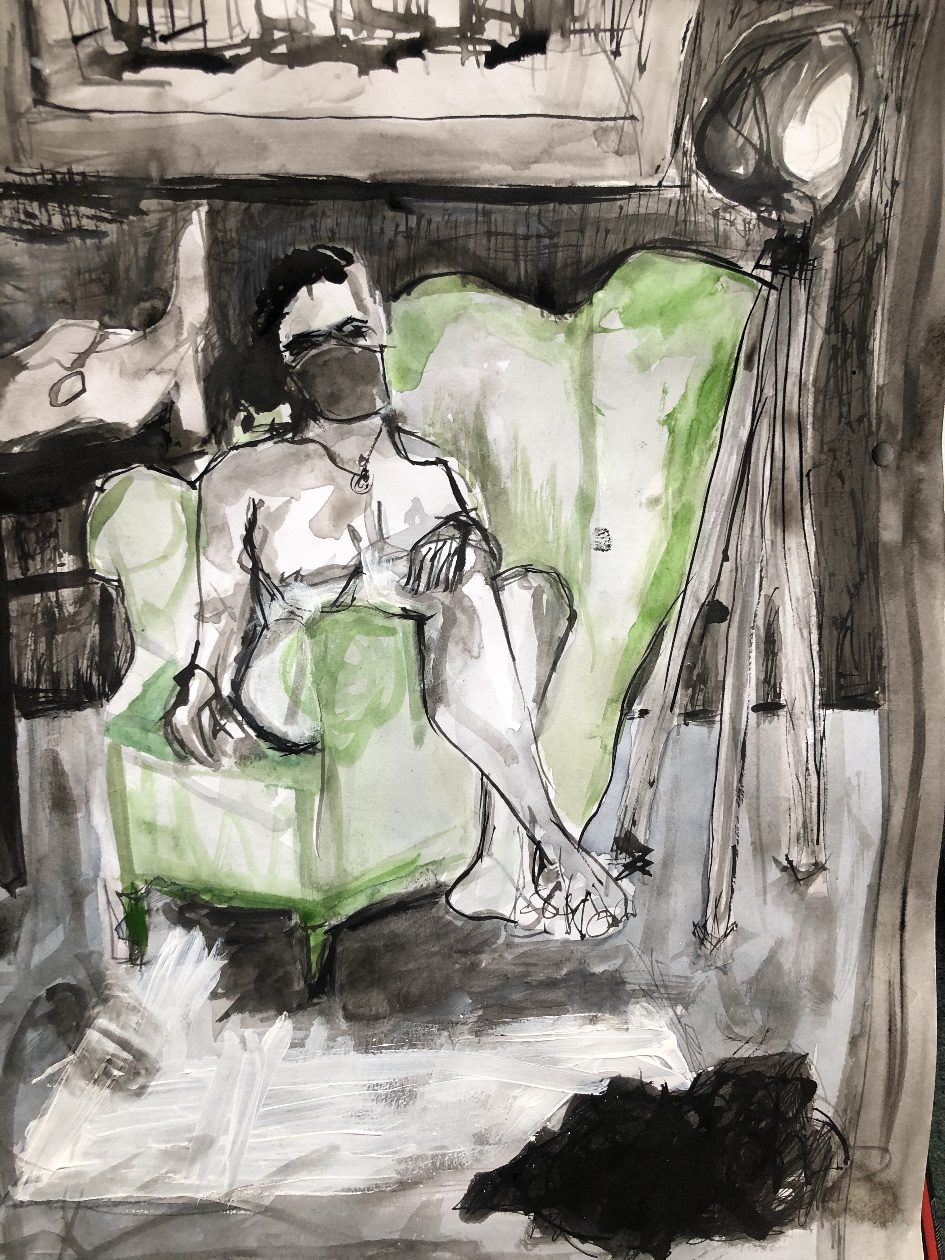
I later worked into my third study from class, at home, without the model in front of me. At this stage I felt a little lost as the piece looked a little manic and unrefined.


I looked again at Diebenkorn’s figure drawings and worked back into areas using black ink on a fine brush which brought the drawing together a little more.

I decided the green looked too pale against the black, and so I worked over it in thinned Prussian blue acrylic. I believe this was a good decision for the blue is richer and has transformed the drawing from looking washed out to looking more tonal as well as enrichening the figure. This task was challenging as I had to use my judgement and imagination but it taught me a lot and towards the end I found myself thoroughly enjoying working this way.

Textiles; Seed head drawings , and a look at some hand stitch artist’s

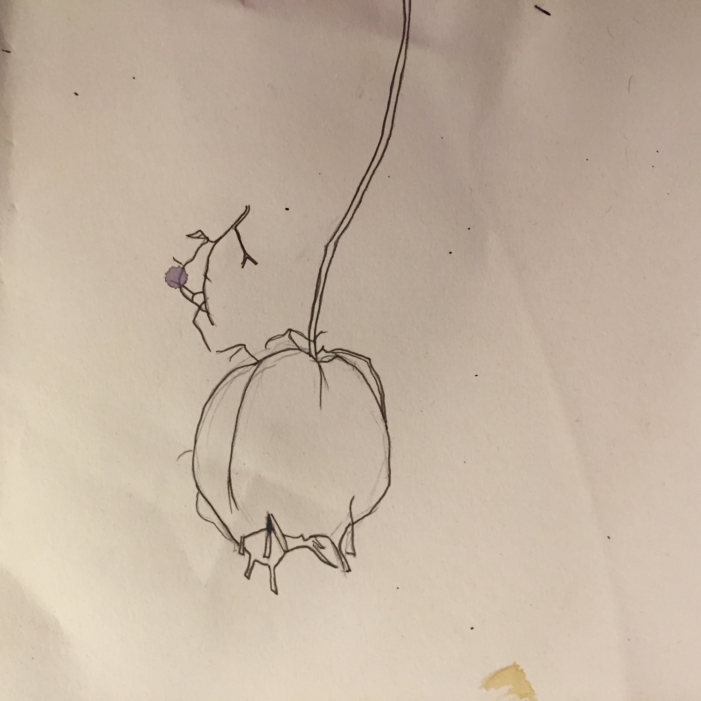
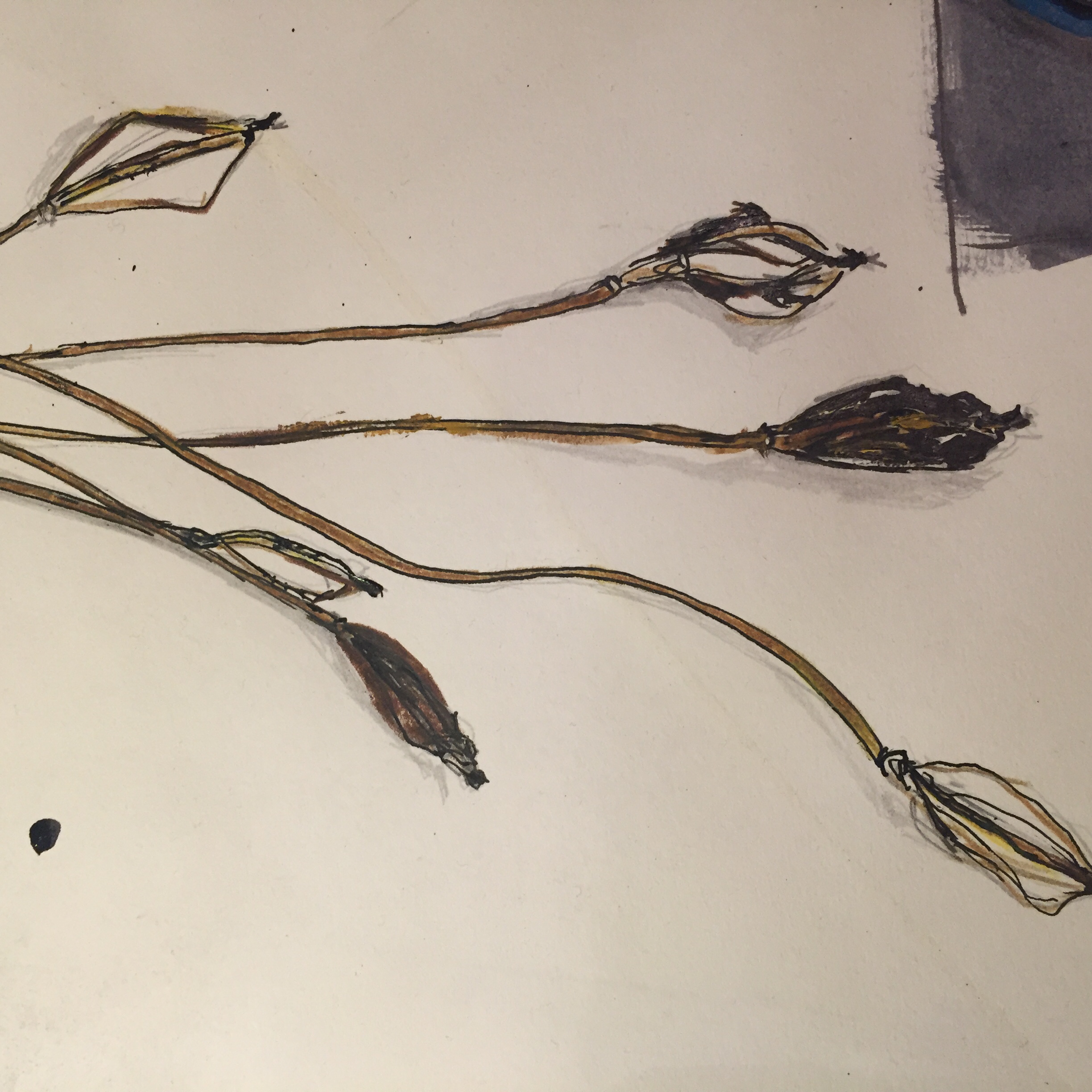
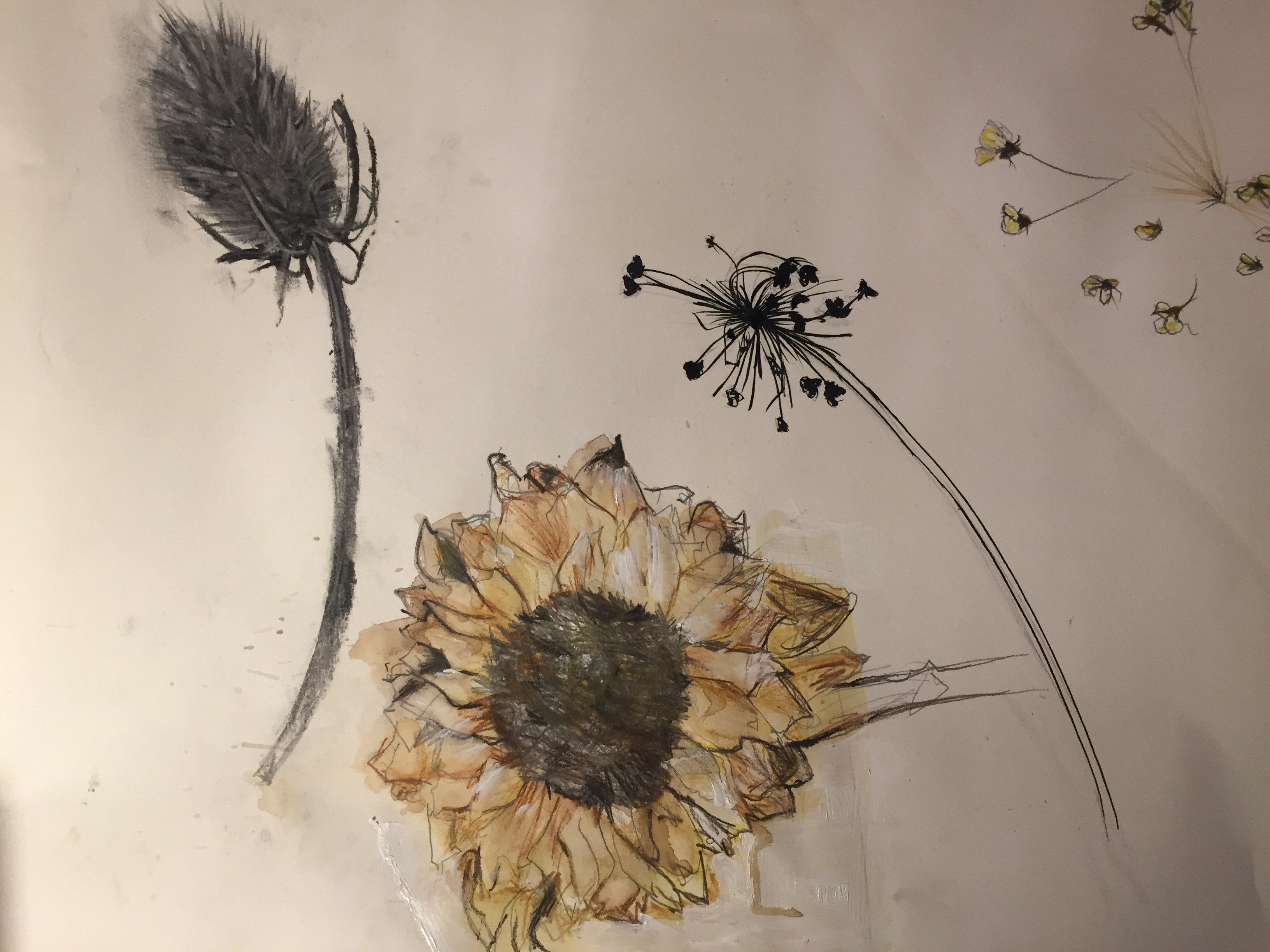
My first textile lesson began with some delicate observational drawings of seed heads, which will be of aid when I come to working on some textile pieces in the next few weeks. For these I used a variety of medias including acrylic, ink, pens and watercolour pencils. I find these mediums work nicely together for each defines one another, for exaple outlining the blue acrylic in one of the seed heads i drew below, ensures the painted aeas stand out and are crisp and bold. It was hard to take in the detail of the seed heads to begin with, but towards the end my eye became more accustomed to looking at their form and I began to draw with more fluidity.

Some of my mixed media sees head illustrations

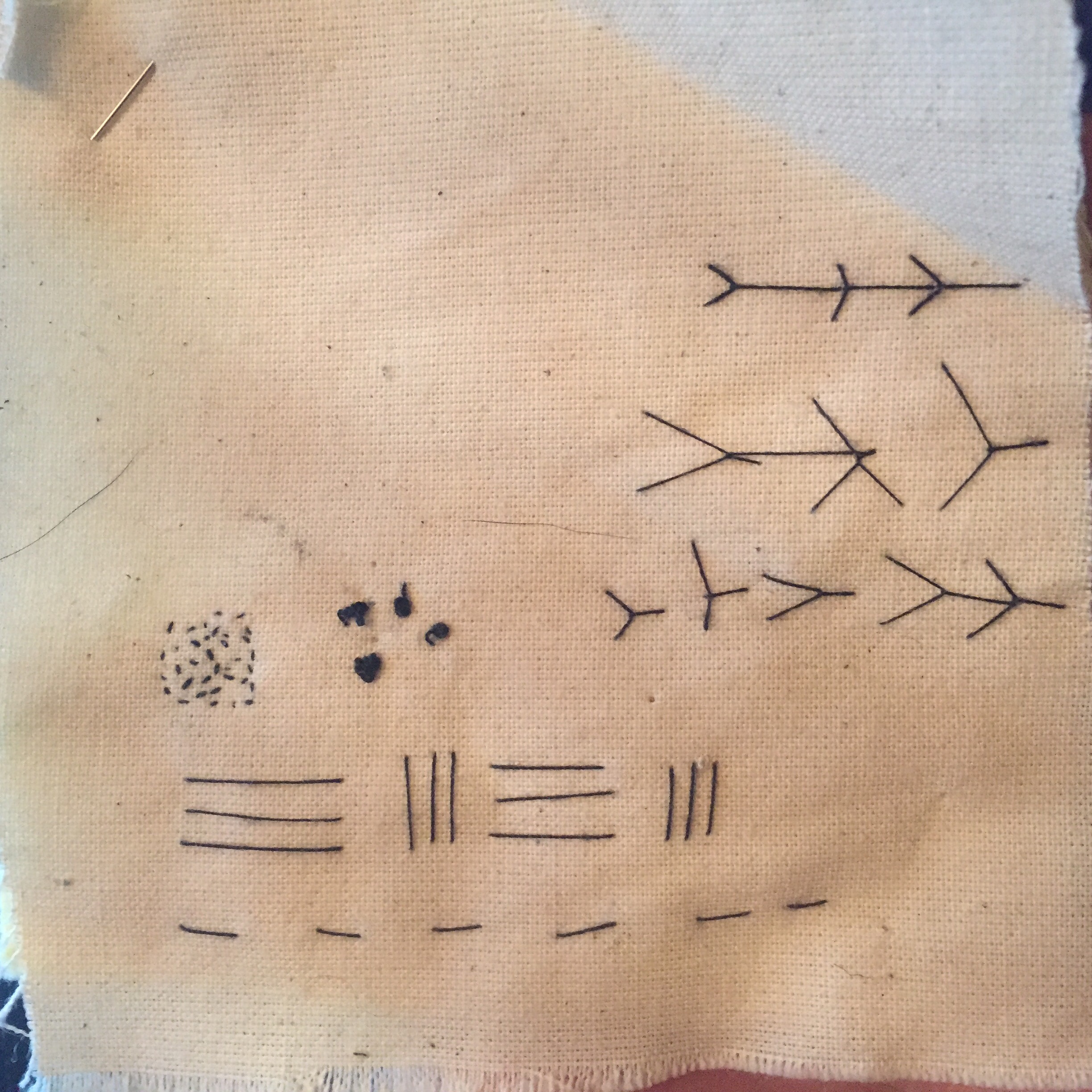
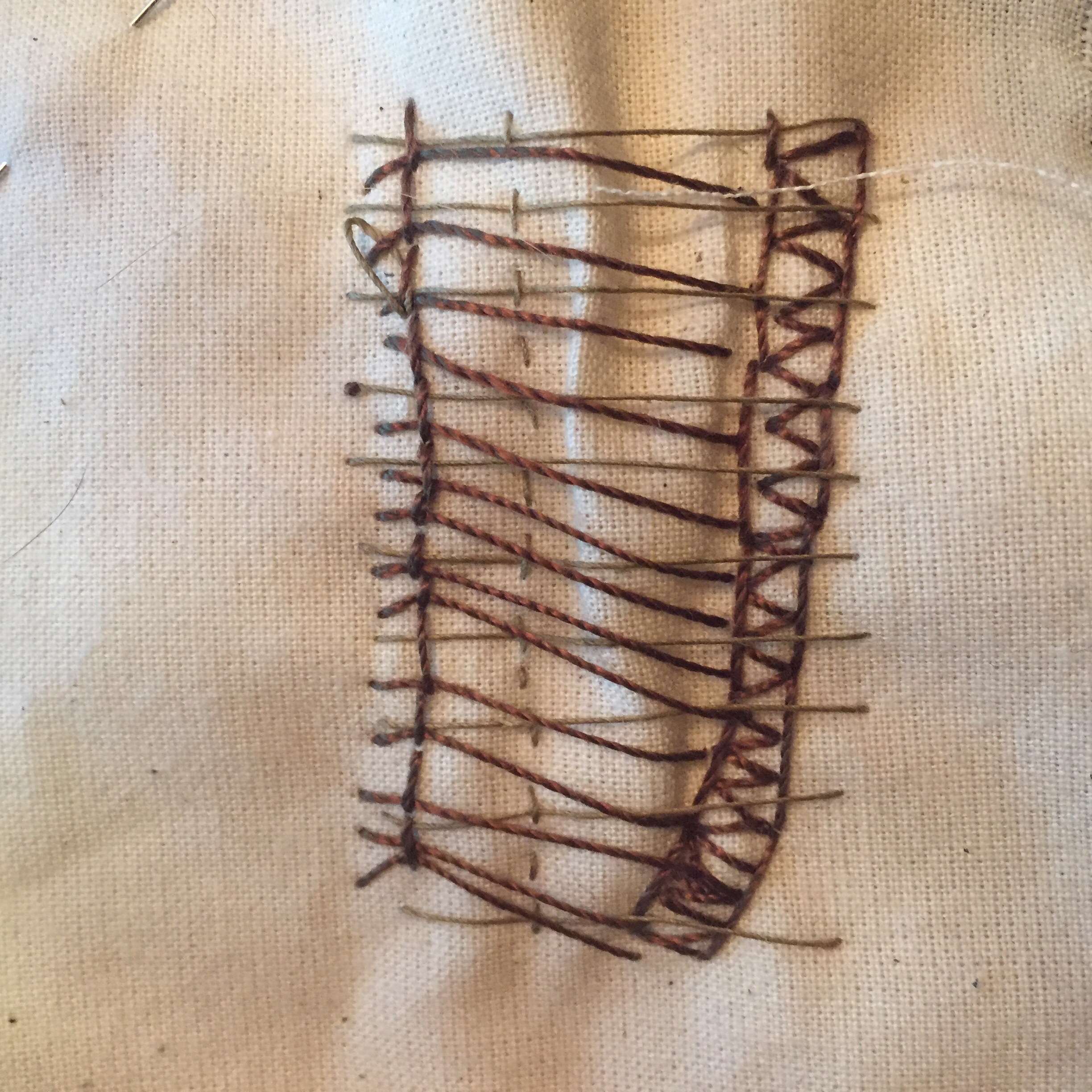
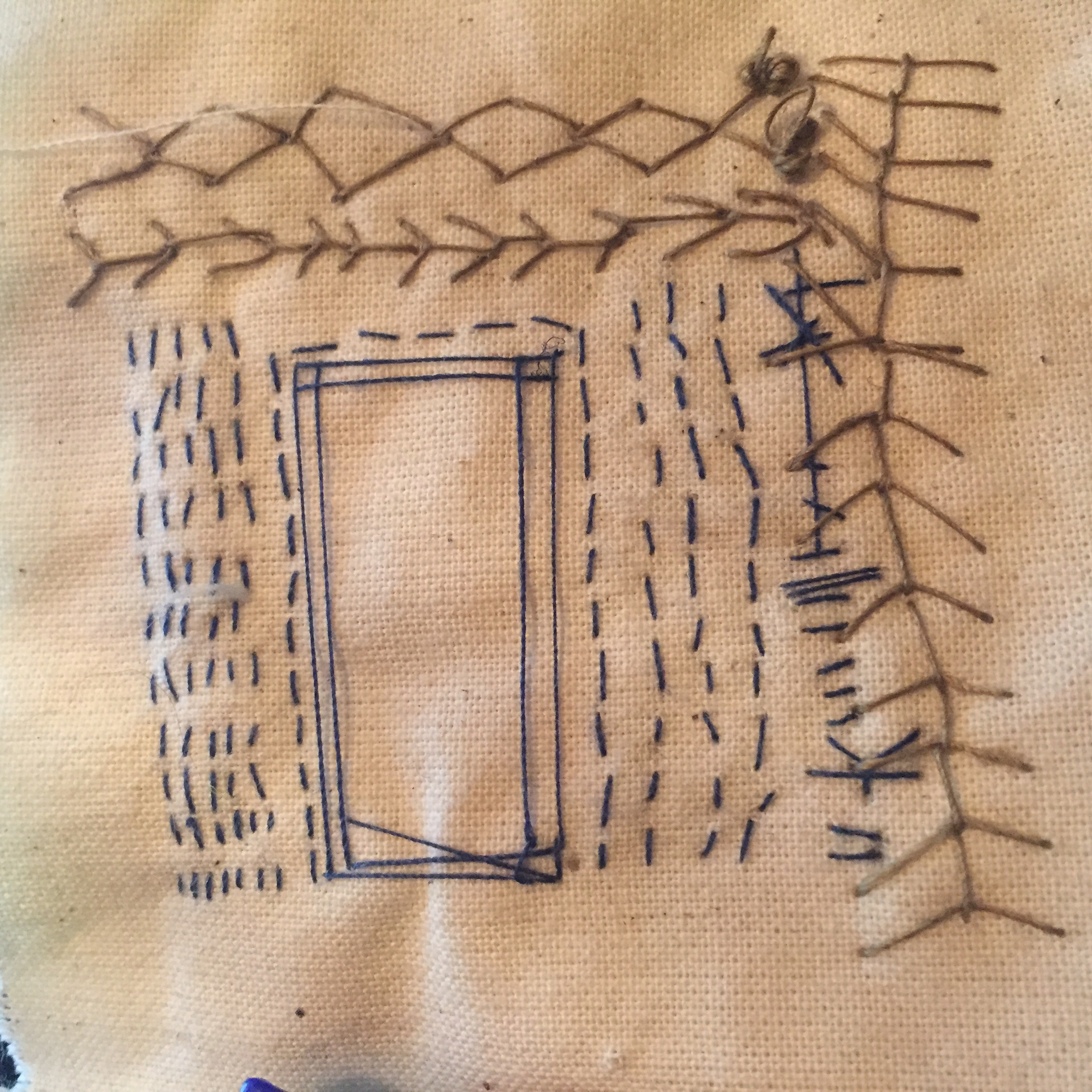
During the second part of the day I was introduced to some hand stich techniques. I’m not so familiar with sewing and it’s not something I am particularly drawn to but I persevered and by the end of the lesson I mastered the fly stitch, french knots, and seed stitch ( i was already familiar with the runningstitch). I then produced severel samples using 3 types of stitch per sample varying their sizes and lengths to create some patterns. I also varied the thread to create different effects. My stitching isn’t precise bt rather a little uneven- by choice, for I prefer my stitch to look loose and wonky, showing character, as opposed to rigid and exact .

Practice sample

Running stitch and fly stitch


Running stitch , fly stitch and french knots

Threaded running stitch , seeded stitch and french knots

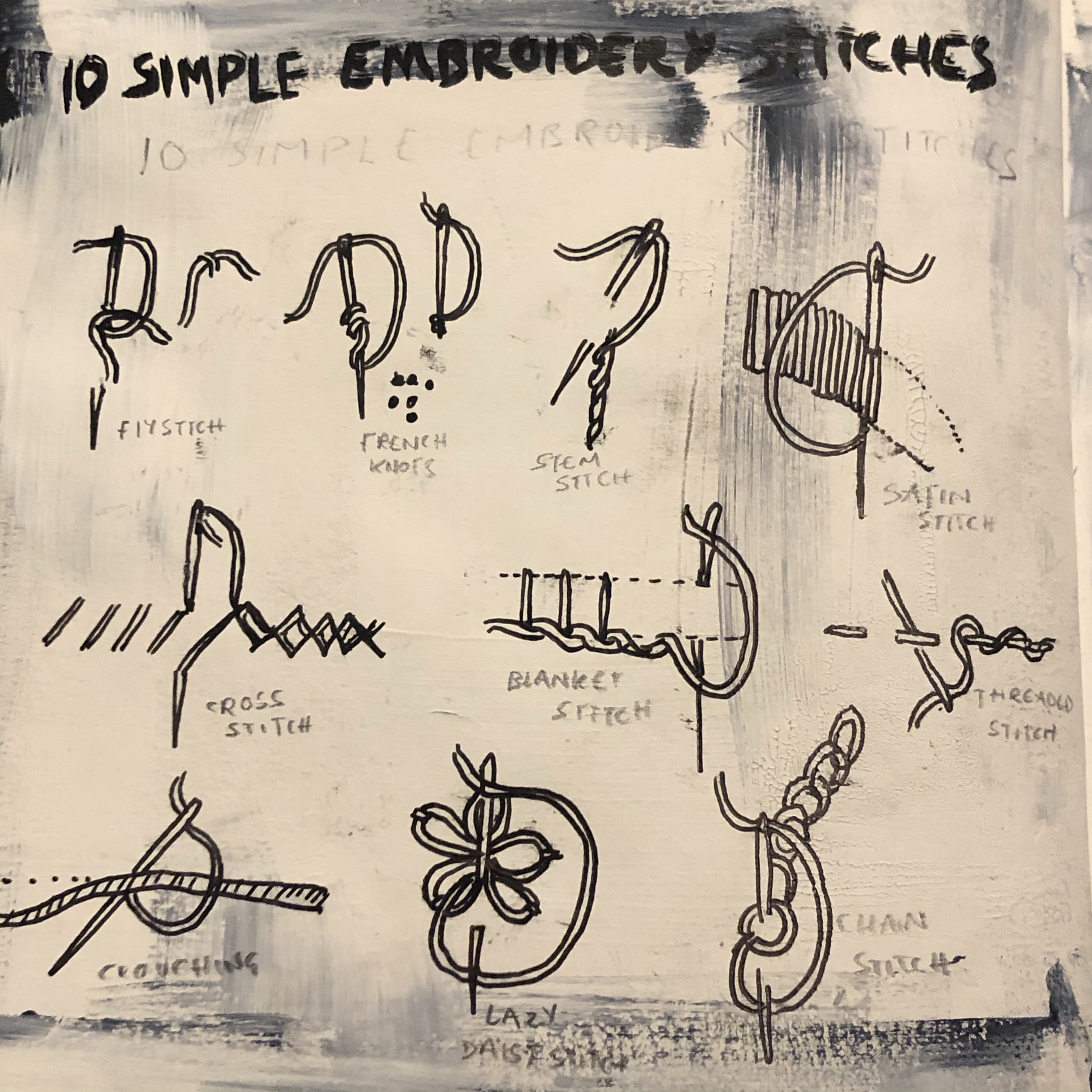
Here I’ve researched and drawn diagrams of ten simple embroidery stitches; fly stitch, french knots, stem stitch, satin stitch, cross stitch, blanket stitch, threaded stitch, crouching, lazy daisy stitch and the chain stitch.

Some inspiring stitch artworks

Embroidered Illustrations by Nike Schroeder | Colossal
Nike Schroeder embroideries - Self portrait redline II | Embroidery art,  Textile art, Embroidery
Embroided illustrations by Nike Schroeder

Before discovering Nike Schroeder’s works, I imagined it would be hard to achieve a sense of flow through stitch. I like the way Schroeder leaves threads hanging in her stitched illustrations for not only is it refreshing, but it lends her piece a sense of fluidity and looseness – notably, in a way that is unachievable through using any other medium. The effect of her something I’d like to convey in any stitched pieces I’m required to produce.

See the source image
Lisa Porch My Name on the Palms of His Hands

Porch appears to have combined several mediums in this piece which, together, create an exciting, livened, surface, which instantly screams to be touched. Her stitching is playful and light and thrives to standout amongst the thick, what appears to be, paint. I don’t particularly like all aspects of this work, in fact I find the piece a little ugly over all but it’s wavering bits of stitch that attracted me.

Tilleke Schwarz interview: Art is in my genes
See the source image
Tillke Swarz

I am particularly drawn to Tillke Swarz’s embroidery work for she seems to capture oddities that she spies. I like work like this for it tends to give me a little insight into their brain, and sometimes I relate to their work by understanding their oddities – this too is what attracts me to Tracey Emin’s work. The marks Swarz creates with stich appear childlike and some areas of her work are layered which creates an intriguing chaos. I notice too, that her colours are nicely chosen and balanced , they don’t clash, but instead appear soft with the ocassinal bright colour here and there. I specifically like the appearence of the letterig lwttering she includes, I’d like to include stitched lettering in some of my work.

See the source image
Tracey Emin

I particularly like that the writing is uneven and messy, it lends the piece a sense of emotion and therefore ensures the words impact the viewer. The bold red stitched contrasts the light airy black hand writing also reinforcing the meaning of the words. The pink of the flowers is balanced by the pink lines and is therefore easy on the eye.

Izziyana+Suhaimi_The+looms+in+our+bones+7_1500px
Izziyana+Suhaimi_looms-bones_6_1500px+wide

Izziyana Suhaimi uses a combination of embroidery and illustration. I like this effect because the embroidery renders the simple drawing nicely, bringing the piece to life, especially as she uses bright colours. I’d like to perhaps incorporate stitch with drawing myself as a way to define my drawings. However, I’d like to create pieces more lively than Suhaimi as her illustrations appear too stiff in my opinion.

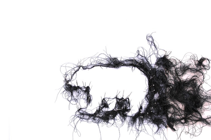
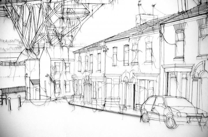
I very much am intrigued by these pieces by Debbie Smyth. She blurs the line between illustration and embroidery. Her charming “pin and thread” pieces are quite raw and structured, and the loose pieces of thread give her work a sense of weight and emotion. She works primarily in monochrome, through this, she has set a mood across her work. “I feel as if I am taking thread out of its comfort zone, presenting it on monumental scale, and creating an eye-catching, and in some cases jaw-dropping, effect,” the artist says.

See the source image

I especially like the way Smyth directs the eye to the figures in these piece by working around them with clumped, untamed stitch.

Design a site like this with WordPress.com
Get started