folklore/myth/legend/fairytale/fable 16.01.21


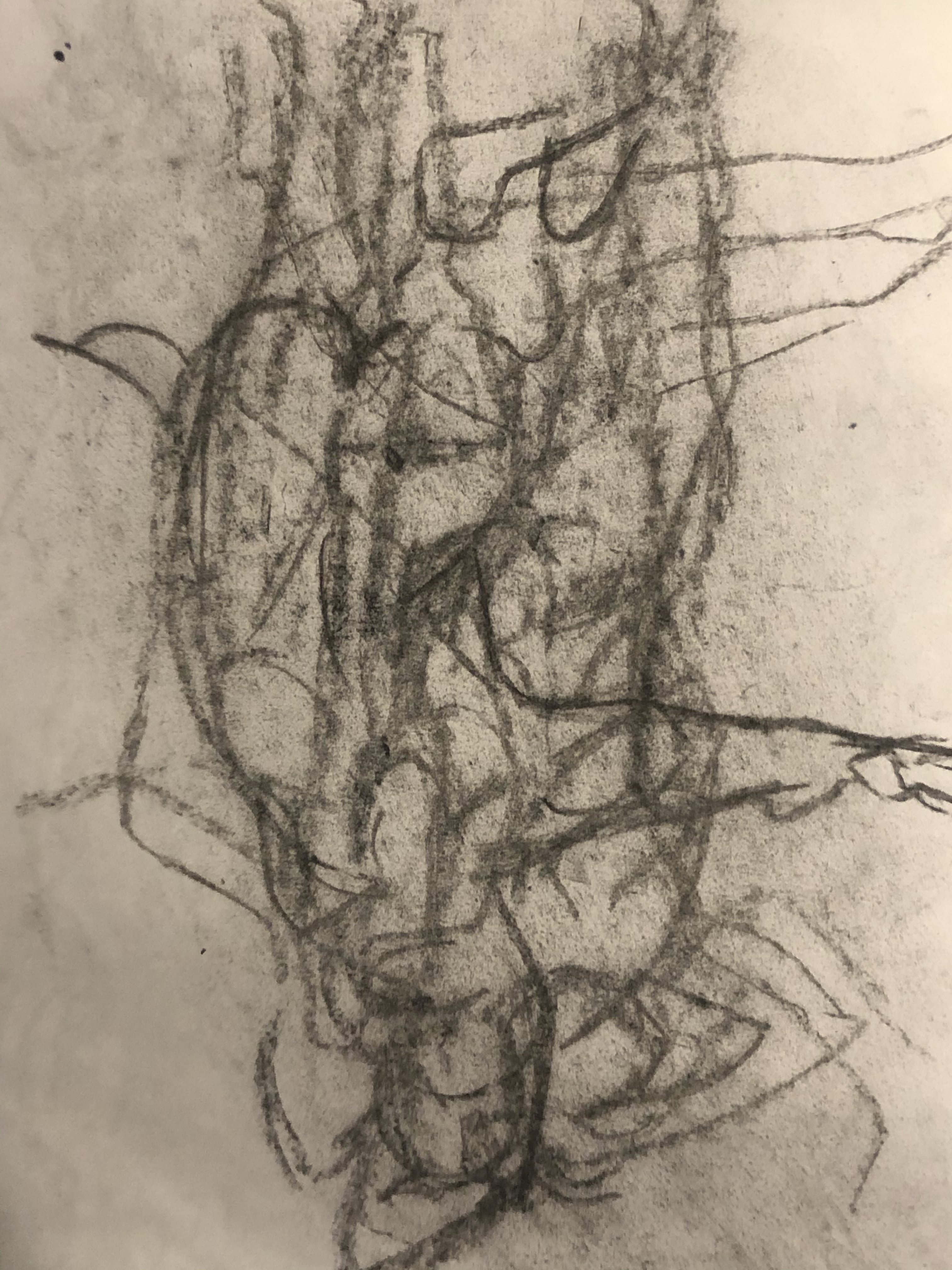
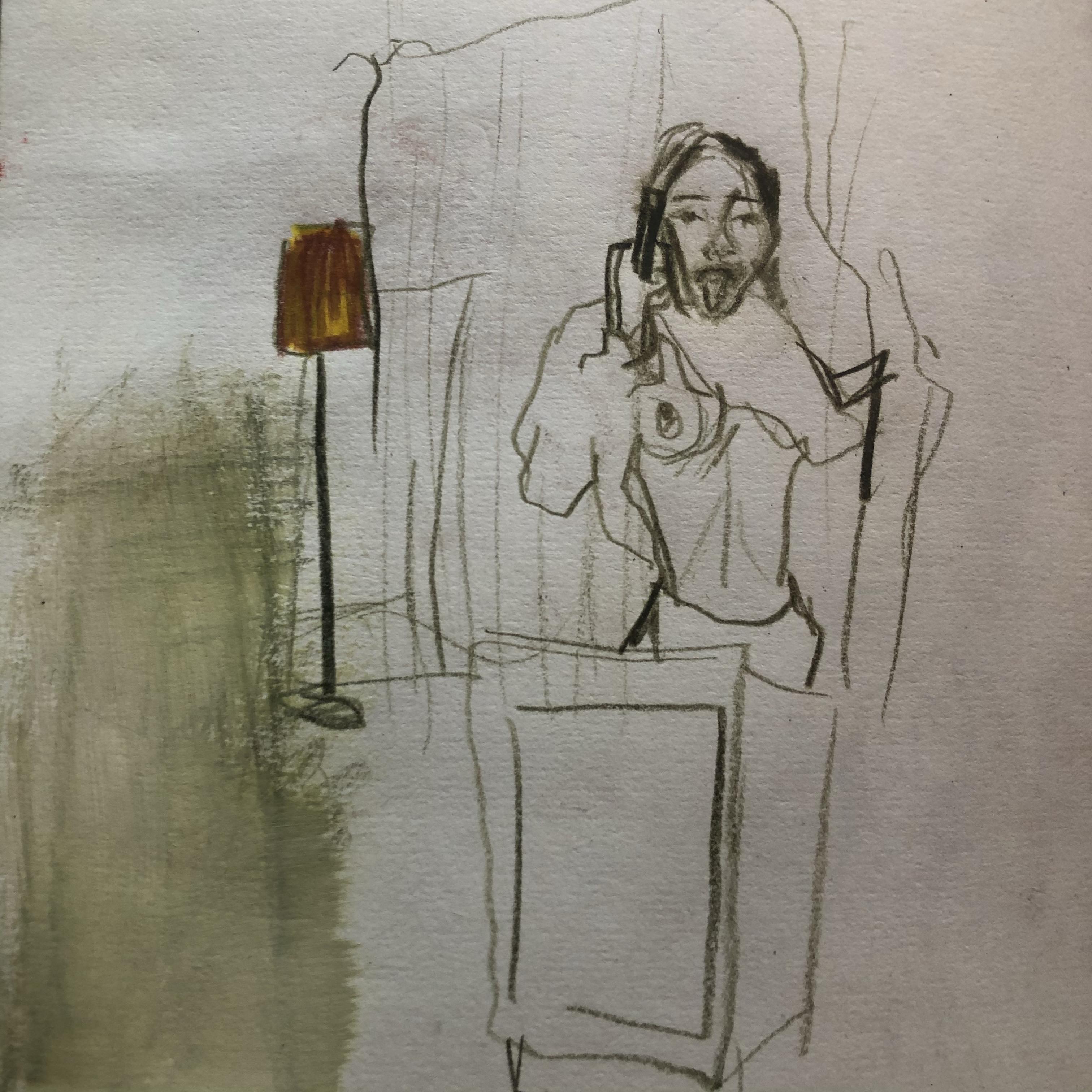
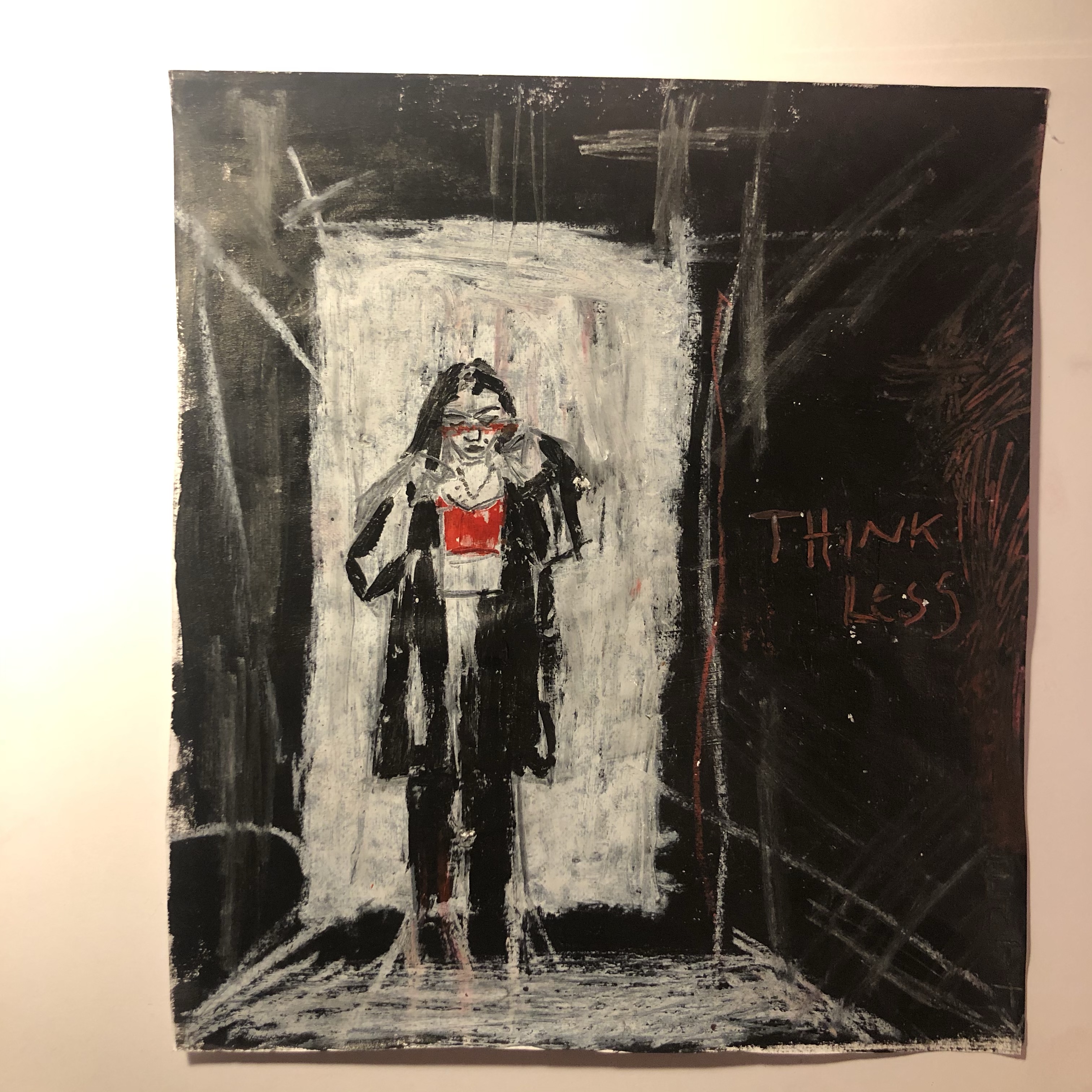
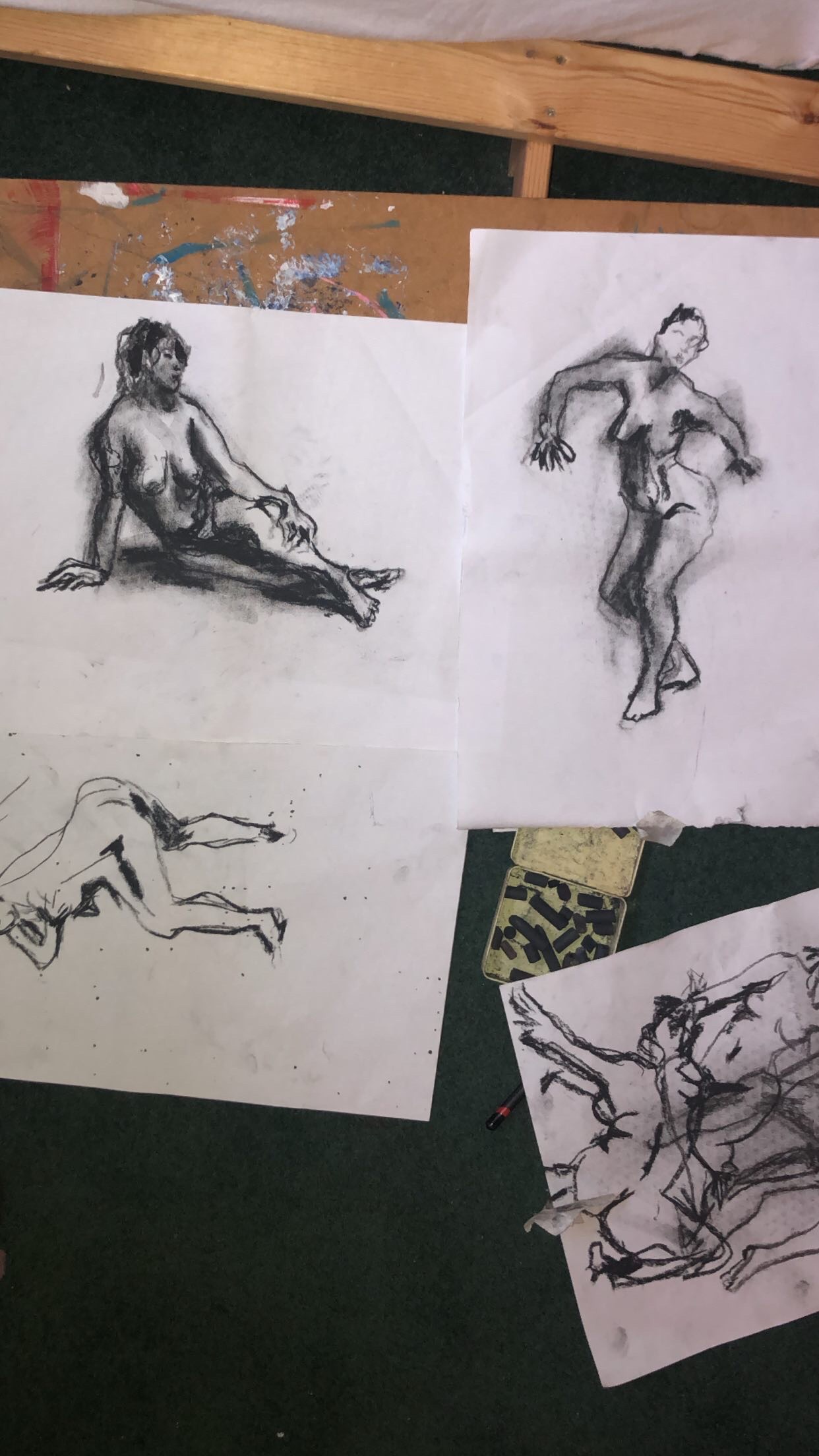
Some of today’s life drawings, charcoal

Today I wanted to loosen up so I followed some online life drawing lessons by ‘New Masters Academy’- although it’s not nearly as good as drawing the figure in real life in front of me, I’m making the best of online resources seen as lockdown prevents me from using the life room. The YouTube videos show the poses for certain lengths of time and they really got me to look and, although I’m not over the moon with the results of today’s drawing I am pleased with the fact that I’ve retrained my eye to pay closer attention to what I’m drawing.

For the one minute poses I used a very soft, light charcoal and just rubbed it out once the time was uo and draw over it, this was a valuable lesson as I taught myself not to be precious and therefore I flowed much more as I drew.

14.01.21 folklore/myth/legend/fairytale/fable

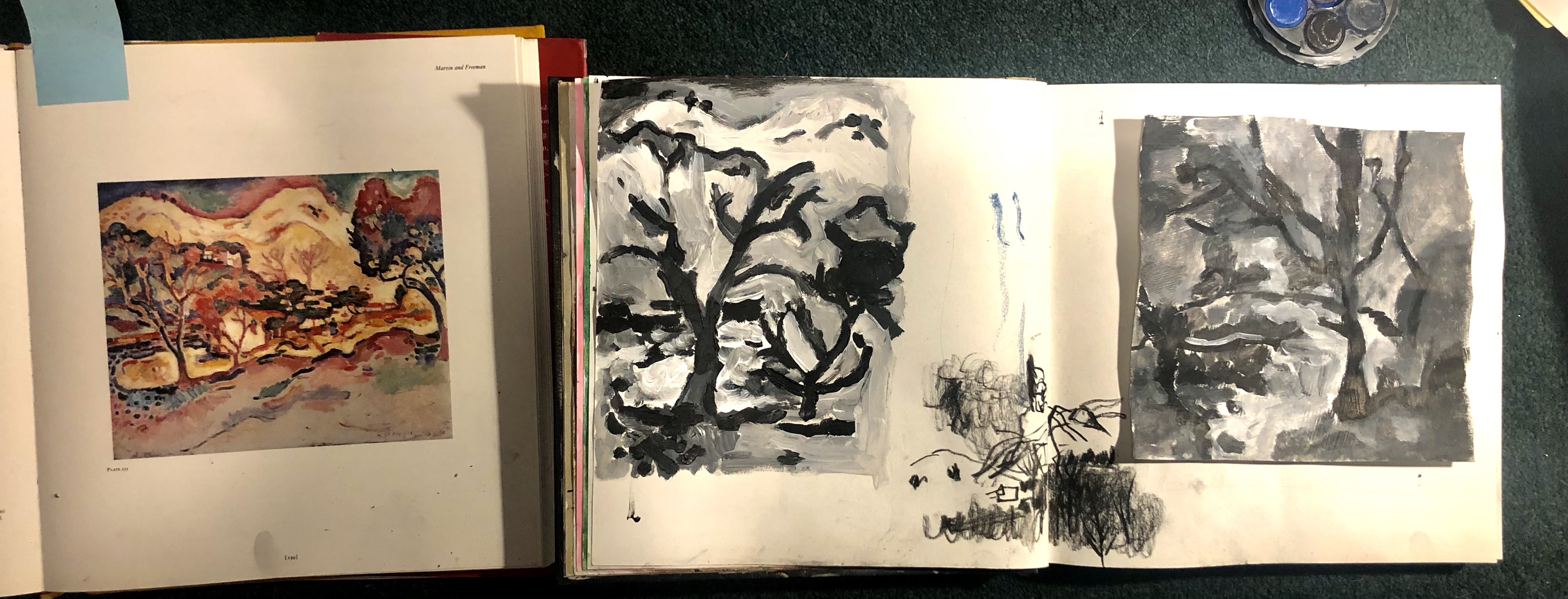
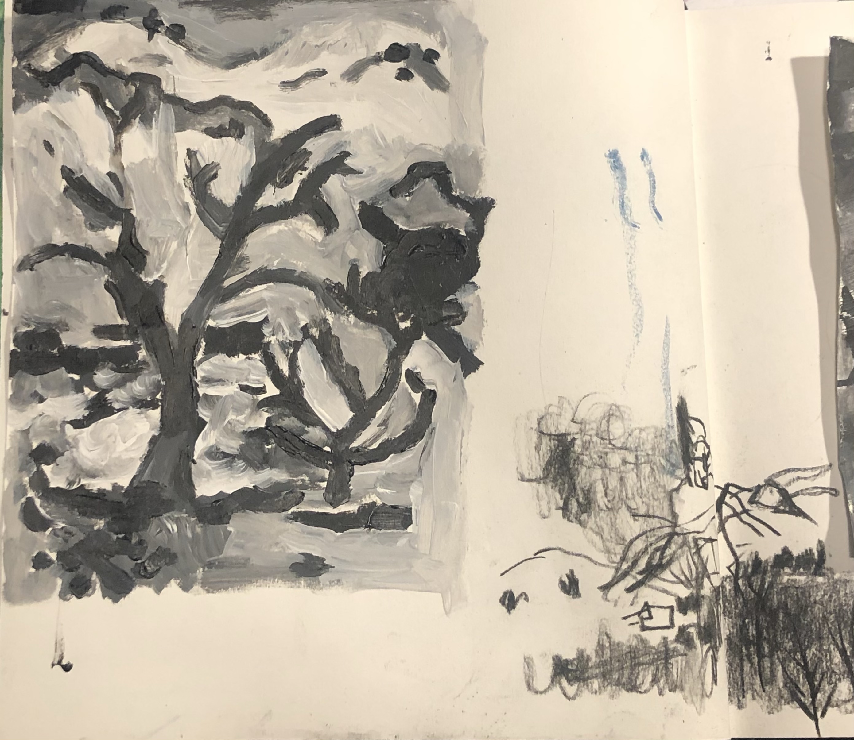
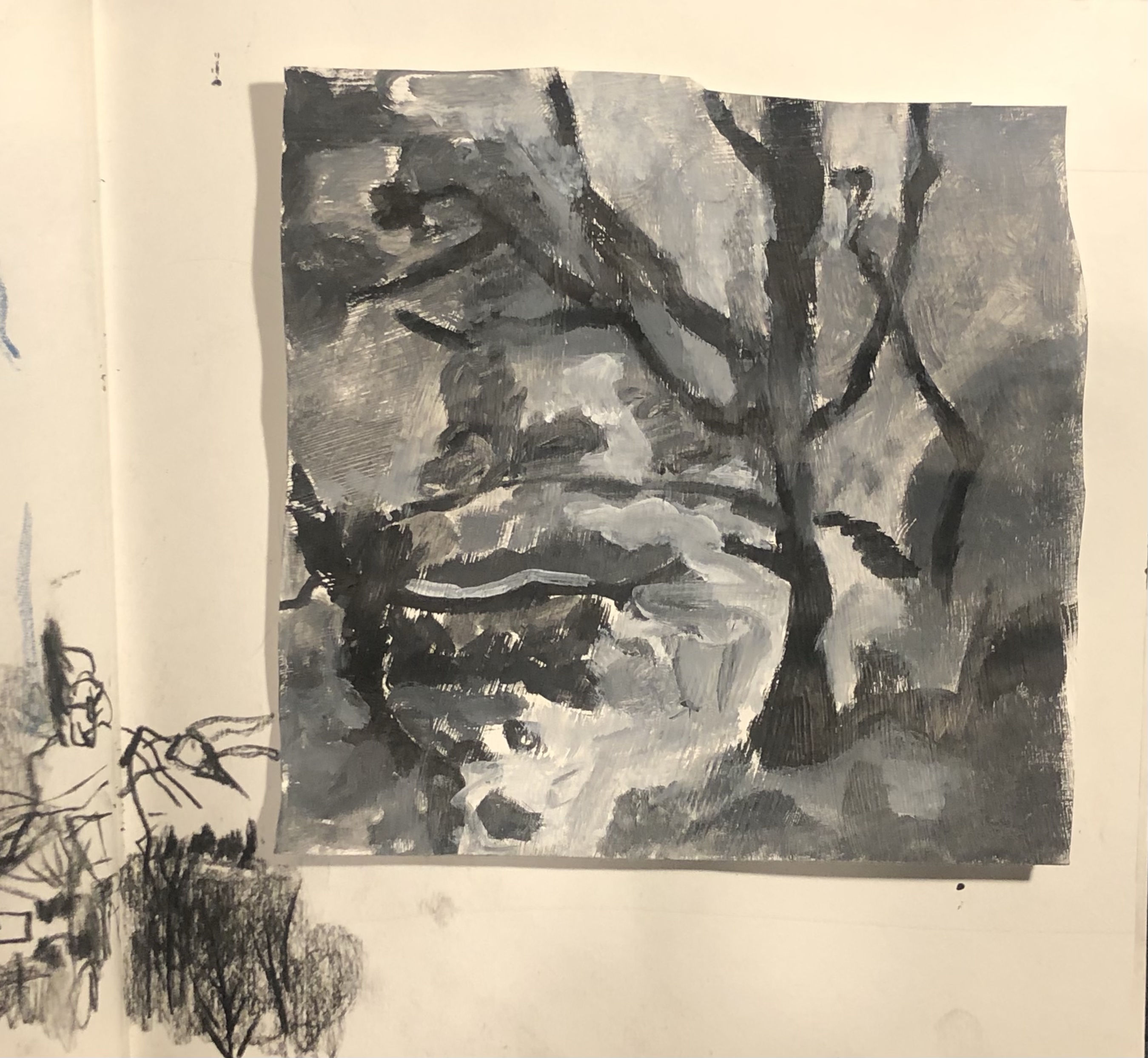
Today I thought I’d develop some more woodland scenes. I first studied a section of George’s Braque’s ‘Paysage à La Ciotat in acrylic, using black and white as I wanted to solely concentrate on brush work without colour as a distraction, besides, I’m still working on generating ideas for Morozoko (Jack Frost) which at the moment I’m thinking of using monochrome colours for. Braque’s piece caught my eye as he seems to exaggerate the life in everything he paints through his curved – bouncy strokes. I enjoyed making a study of his work and as much as I enjoyed painting the tree itself I enjoyed painting the gaps in the branches – the background, equally and I’m fairly pleased with the outcome. I then went on to paint a study of one of my own photographs of a woodland scene in the style of Braque but this time in oils. I became immediately excited the minute my brush touched the paper, loaded with oil paint, as I realised oils are to disclose all sorts of new grounds for me to explore!

Acrylic study of Braque’s landscape
study of a woodland scene in oil paint in the style of Braque

13.01.21 folklore/myth/legend/fairytale/fable


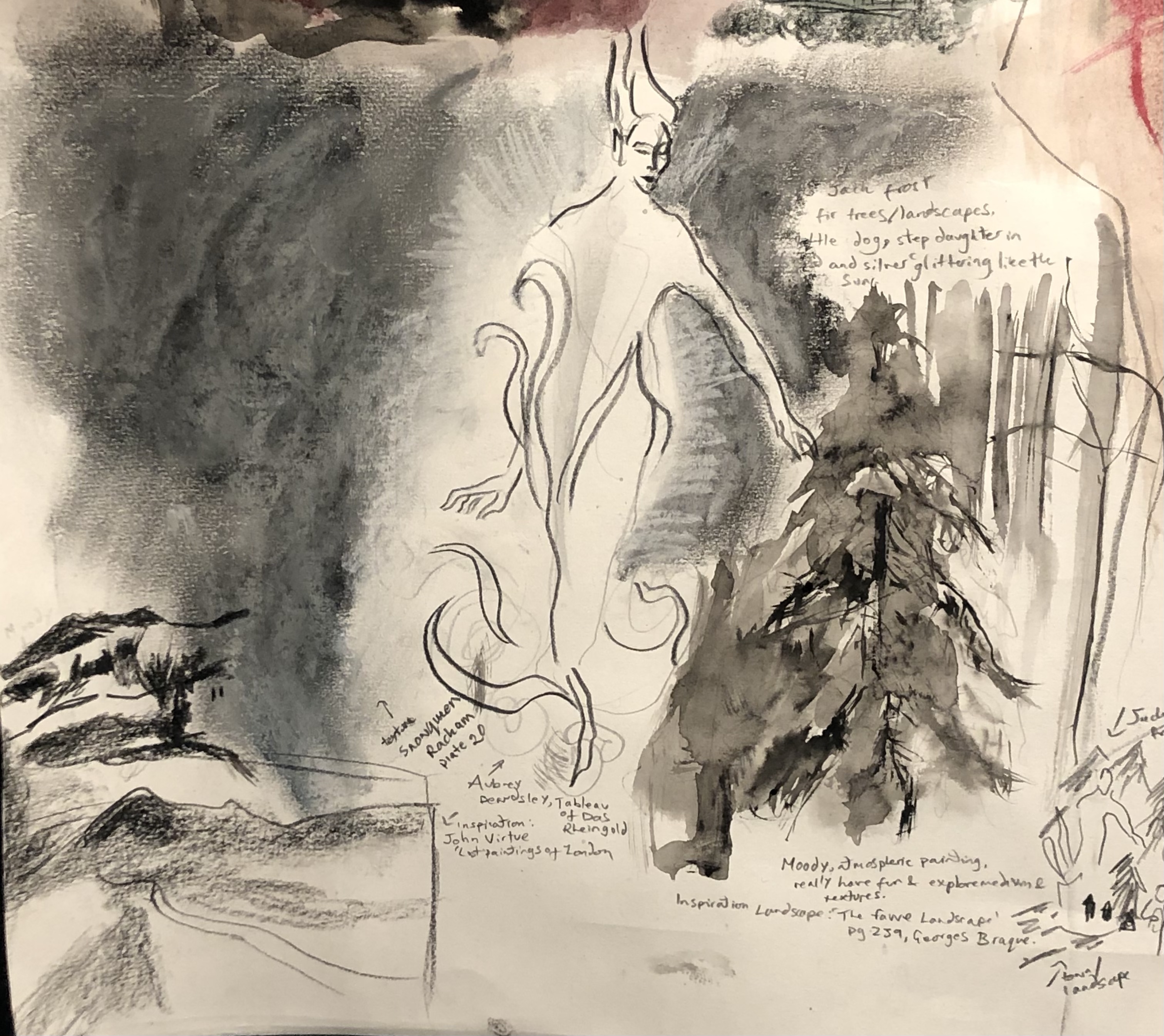
Idea generation for fairly tale Morozoko, the Russian version of Jack Frost, on my design sheet

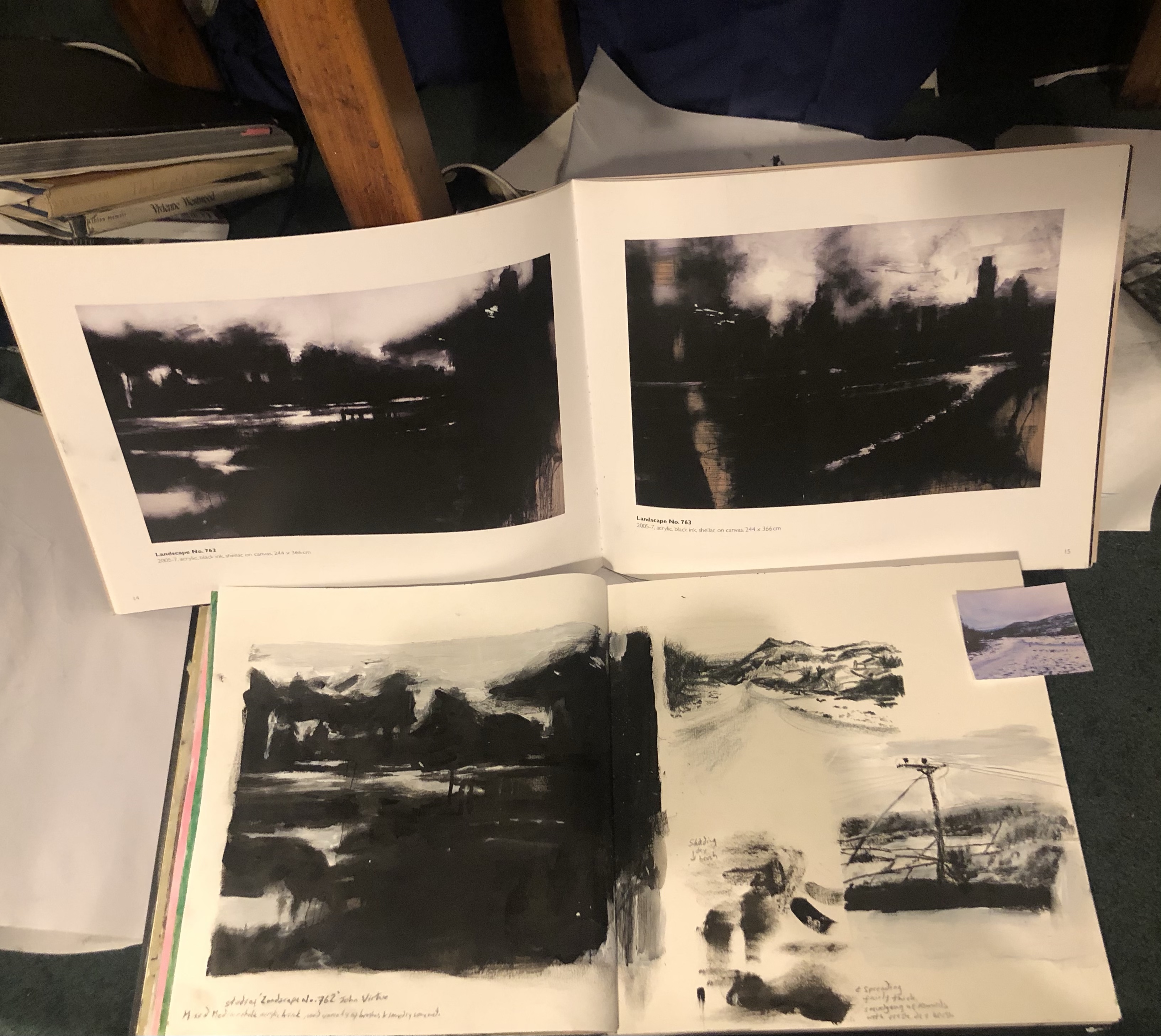
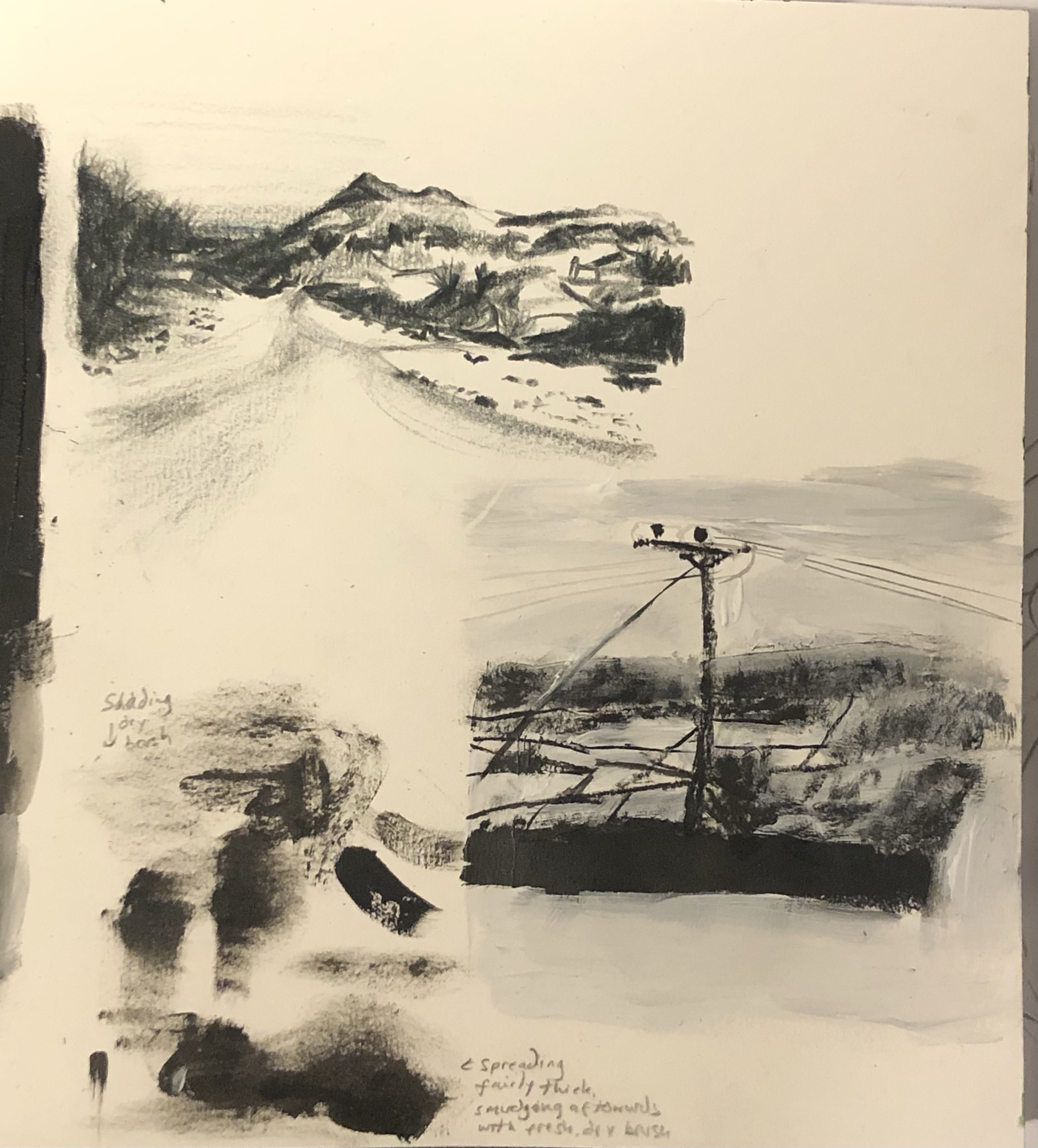
Today I have begun developing the ideas I came up for a painting on Morozoko, in my sketchbook. I looked John Virtue, who paints beautiful moody, atmospheric paintings of London. If I were to peruse Morozoko as my final painting for this project I was thinking something along the lines of a dark atmospheric painting, that may be taken quite seriously and aimed at the older generation, and so I produced study of Virtue’s work to get to grips with dark colours and the way virtue allows himself to paint gesturally yet deliberately. I then produced some studies using my own landscape imagery, inspired by his style:


I also spent some of my day following some of ‘New Master’s Academy’’s life drawing videos as I wish to produce some more life drawings to strengthen my portfolio for university.

Selection of ten Artworks for Portfolio

Measured Life Drawing, Pencil, A1
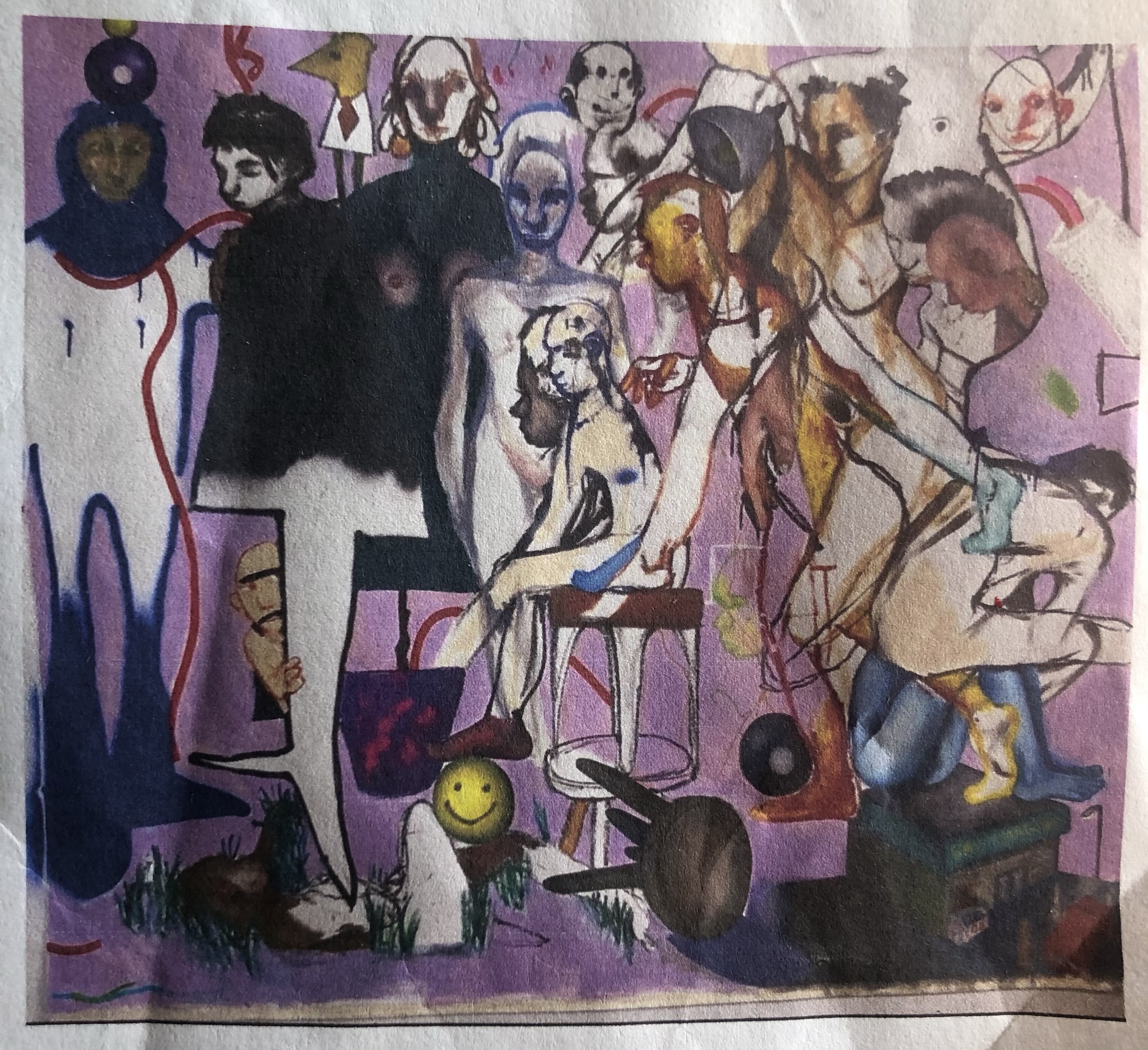
‘Weird Dreams’ , Mixed media – Pencil, Ink, Acrylic, Charcoal, A1
Childhood Project sketchbook page, Pencil, Ink, Acrylic, Charcoal, Chalk, Oil pastel, 38cmx19cm
Childhood Project sketchbook page, Pencil, Ink, Acrylic, Charcoal, Oil pastel, 38cmx19cm
‘Plastic Ocean’, Collage, Ink, Acrylic, A1
‘Feast’, Charcoal, Ink, Acrylic, 191cmx138cm
‘Pentraeth Landscapes’, Watercolour pencil, Oil pastel, 20cmx20xcm
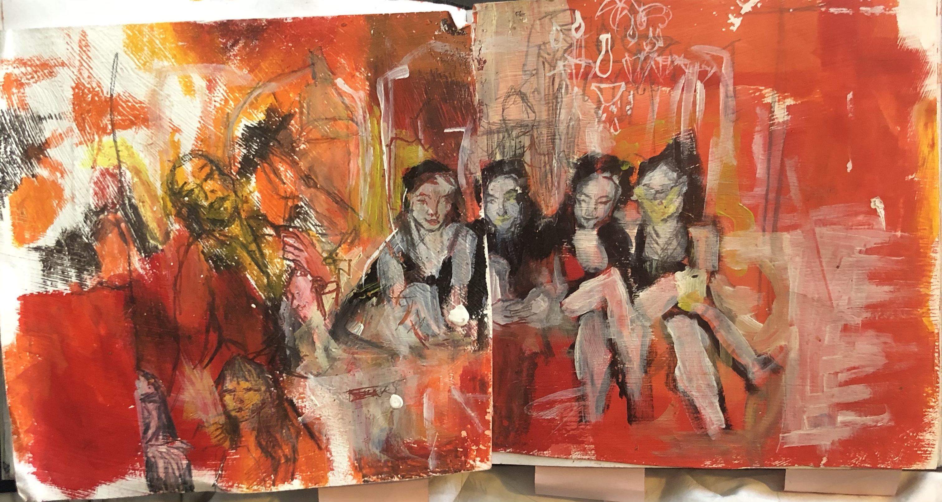
‘A House Party of Oddities’ Sketchbook page, Acrylic, Oil pastel, Pencil, 38cmx19cm
A House Party of Oddities’, Acrylic, Ink, Chalk, Charcoal, 230cmx165cm

Reflective Evaluation for my Independent Project; Night In/ Night Out

Given the theme ‘Night in/ Night Out’ and the opportunity to specialise and work in which ever way I liked, I decided I wanted to paint a canvas revolving around a night out, inside, for some of my best nights ‘out’ have been house parties my friends and I have held. I suppose I wanted my piece to depict a house party of oddities.

I first jotted down and investigated some ideas in the form of a design sheet, through collating all the information I could that personally revolved around the theme. My selection of inspiring images , first hand photos of friends, rooms and objects, soon prompted ideas and I quickly discovered that I wanted my painting to feature an image of my friends and I sat in a bathtub and that I wanted the painting to be atmospheric and beaming with light.

Throughout I wanted to challenge myself through this project, as my aim this year is to grow in skill and confidence, and so I ensured I did not cut any corners within my experimentation.

In order to begin experimantation I conducted some research, in the college library and through the interenet. At first I found painters Bonnard, Michael Andrews, Ekaterina Popova and Christopher Le Brun whose work stood out through their use pf atmosphere and light in thwir paintings. I studied their work closely and began sketching. Note, I didn’t replicate their works but instead, I applied their techniques and colours to my own ideas for I find this much more efficient in moving forwards with my own work. I first created some soft, pretty looking images which I wasn’t so happy with, they didn;t feel right; I wanted to create something with more vigour, energy, dynamic, and something more exciting. And so I picked up a book of Basquait’s work which evoked some richer, more lively experimentation using acrylic, charcoal and ink. I worked with energy and passion from here. When noticed myslef using lots of red I steered myself away and ensured I introduced other colours within my expereimentation, despite feeling comfortable painting in red, for I wanted to create something new and different from my last body of pain ting work, which was very red.

I was thinking about my project day in day out, using the world around me as inspiration. Wherever I’d go I’d take photos or make sketches, whenever I was scrollong on social media/ pinterest I’d screenshot things I found inspiring, it was as though I was seeing through a hungry eye. So, my final outcome features many objects and snippets from my day to day life. Using current surroundings as some of the basis of my piece ensured that it felt fresh to work on trhoughout, and theirfore I was able to upkeep my motivation.

At one point I found my sketches and experimentation to be looking a little flat, and around this time I began looking at an artist called Bryant Giles whose work often features layered illustrations. His work inspired me to layer elements which steered my work away from appearing too flat. I also took reference photos of rooms to draw as well as drawing some from life in order to include a sense of space and perspective within my work. From here my work started to move forward a little more smoothly.

I put off starting the canvas for a little while. Its size intimitaded me. My way of overcoming this was by forcing myself to pick up a piece of work and setting the small goal of making just a few marks. This is what helped me break the ice, and I soon found myself drawing across the entire canvas. If ever I found my self dreading working on it, this is what I’d do; set just a small task which always broke the ice and encouraged me to do more. Generally, as I worked on the canvas I would refer back to my sketchbook making extra studies when I discovered I needed to grasp something in more depth. For example how the light would lay on a figures face or to plan colour combinations. I found this an extremely effective way of working for it ensured I was painting with confidence and purpose on the canvas each time. Through working this way I have truly discovered how to really use a sketchbook as opposed to just making ‘pretty’ drawings in it. My sketchbook was in fact my main reference for the canvas.

The canvas is made from a bed sheet stretched over a frame whcih I primed with emulsion. It was nice working on something I’d built myself. I’m a little disappointed to find that the canvas has slackened , I must, in future ensure that I stretch it even tighter perhaps I could get more people to help me stretch it.

I used a combination of chalk, acrylic, ink, charcoal and a little oil pastel for the final piece f for I found they’re a combination I discovered I really enjoyed using within my workshops. Each medium can be used to build and and define one another and create strong synamic pieces. I first sketched the elements in chalk and then proceeded to rid of the white of the canvas using ink and acrylic washes- a technique Iwan taught me. Another technique I found myself using that Iwan toaght me was, that when I felt overwhelmed by the large canvas I would cover areas in a sheet and focus on sectioins.

I would without a doubt say this project challenged ,me, I was constantly feeling a little put of my depth and I times I felt I really was struggling. I found at a certain point I felt completly lost and unable to bring the painting together, I just couldnt see the finsihing point. However, my soloution to this was realising that I needed to change it; I needed to stop working on minor details, I needed to make a drastic differnce to the painting. I took some photographs of of the painting on my phone and using the ‘markup’ tool on the basic photo editing booth, I experimented by colouring in different sections to see what it would look like, drawing in new, bold elements. I settled for a version and made some drastic, quick changes on my canvas. From here I was able to move forward as the piece no longer looked stagnant, it looked fresh and I found new areas to work on.

In some instances I wanted certain figures to be holding certain obects/performing certain tasks, and I was unable to get an exact reference so I would pose in front of the mirror holding the objects myself and modifying the original images to suit how I wanted them to appear- through using myself as a reference. Through doing this, I think I have really deveolped my practice and confidence as I rely, now, much less on photographs and instead, use phtotgraphs as merely an aid- asoppose to exact references.

Overall I am pleased with the piece. It is dynamic, with lots to look at and I’m especially pleased that thoughout working on it and forced myself to take harder routes along the way, and more specifically that I was able to successfully create the sense of light and atmosphere that I had intended to. I have used many techniques, such as a more realistic style of painting alsongside a rougher, looser style of painting and I think this is what makes the canvas captivating. I had intended to experiment and use varnish within this piece but I was so engrossed in the subject and the composition that I shyed away from doing so. Varnish is most defintiely something I will experiment with in the near future. I purposefully chose these colours together not so that they would complement each other but so that they’d clash a little in order to emphasise the oddities strung throughout. Although the white too, was left and chosen purposefully, I think that perhaps there’s too much, especially around the center of the piece, and the bath tub too is a little too big- although I could argue that it works as the piece isn’t intended to be perfectly exact in dimensions and perspective.

I knew I was pushing myself in choosing to work on a canvas this size , it occupied all the time I was given right up to the deadline. But, I realise, that working up to the deadline actually benefits me as it keeps the pressure on me and ensures I have a clear cut off point where I must stop and realise I have done all I can, and serves as closure. Most of all, I am pleased with the discipline in which I worked with throughout this project. I realise now as I write this, that this painting has taught me most, not most about technique- although it has plenty, but how to work and battle alongside my own mind, and how to overcome my own self-doubts and struggles – which I’m certain will be of great aid to my development as an artist in the future.
Artists who have Influenced my Independent Project; Night In/Night Out

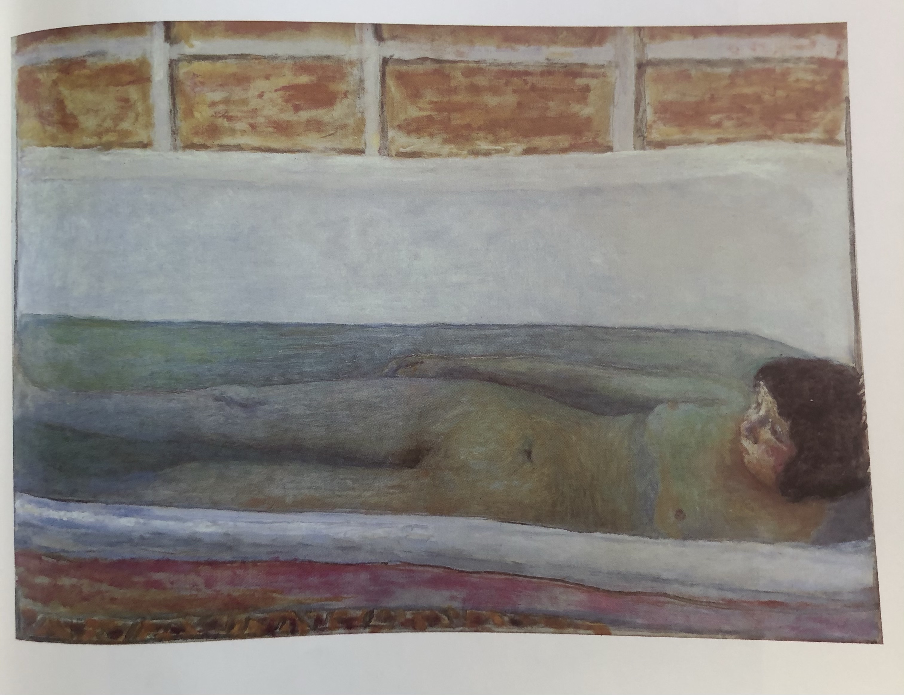
Bonnard

Bonnard shows excellent examples of light and atmosphere within his dreamy oil paintings and so I studied them and from there produced my own studies using similar colours and effect. I realise that Bonnard seems to use the white of his canvas to his advantage, giving his paintings an almost-grainy, dappled light effect and so I allowed areas of the white paper I was working on, to show through, which has successfully created a similar effect to his.

The Spring or Nude in the Bath 1917, Oil on canvas
The Vigil, 1921, Oil on canvas
Self Portrait in a Mirror, 1938, Oil on canvas
The Bath, 1925, Oil on canvas
Standing Nude, 1928, Oil on Canvas
My study, attempting to indicate light and atmosphere from looking at Bonnard’s works, using light washes of acrylic on emulsion primed paper.

Another of my studies, in pencil, again influenced by Bonnard’s use of colour and atmosphere.

John Watkiss

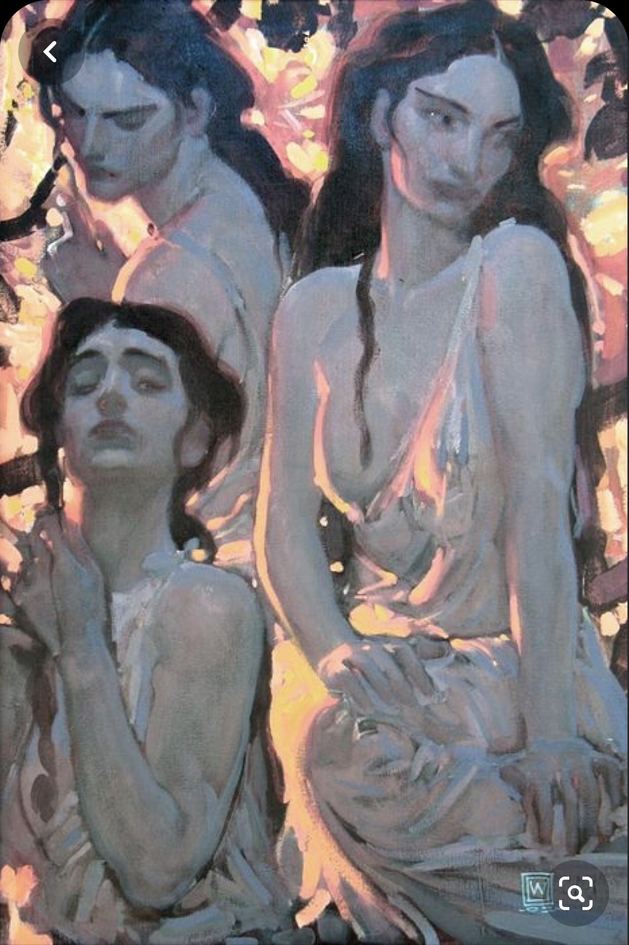
I am attracted to this painting by John Watkiss for the artist has beautifully delineated a glowing light across the figures. The whole painting appears to radiate and shine with light, through the strokes of yellow pinks that contrast the dark locks of the figures hair.

Painting by John Watkiss

My study using a similar pallet to Watkiss, Acrylic
A second study influenced by Watkiss, Acrylic

I attempted to paint my figures in the style of Watkiss but I must admit these are not my best studies. I used acrylic and found it difficult to blend the way Watkiss has, and I ought to have mixed a better colour pallet for the shades are slightly off and don’t quite work so well together. As I painted these studies I soon discovered that I didn’t find so much enjoyment painting in these colours, I find them a little sickly and I think I’d like the figures in my painting to contrast an atmospheric background which would mean using a different colour pallet to an atmospheric pink, yellow, red toned background that I’m planning. I would also say that even through the second study in Watkiss’s style I didn’t improve and I think it’s because I really found no enjoyment in it.

A third study inspired by Watkiss’s use of light and shadow, Ink and Acrylic

I would guess that Watkiss used watercolour along with acrylic in his painting, for when I attempted this third study (above) in black and white washes of ink and acrylic, I found it much easier to create the smooth, blended effect that Watkiss renders his painting with. I enjoyed working with more fluid mediums and I think this shows as this study is much more competent, showing a lot more flow and the brush strokes appear less forced or scrubbed. I would say I am also able to show more character with fluid mediums for my lines are much less rigid.

Jean-Michel Basquait and Christopher Le Brun

I am drawn always, to Basquait’s work, for his ideas seem to flow thrpough his loose, expressive strokes. I also wanted to introduce a sense of wildness in vigour into my work which I knew I’d attain through looking and studying Basquait’s works. Jean Michael Basquait’s work always reminds me not to take work too seriously, his playful child-like marks remind me to have fun, which is how I went about creating gthe studies below; I allowed my lines to be free and go in the direction my hand would take them. I also worked on them quickly for my mind did not act as a barrier to my brush and I found myself making disoveries from these experiments a lot more than when I work in a less playful manner.

Basquait, ‘Excu’, 1988, Acrylic and oil stick on canvas
Basquait, Untitled, 1981, Acrylic, oil stick, paper collage and spray paint on canvas
Basquait,Untitled (Fallen Angel), 1981, Acrylic and oil stick on canvas
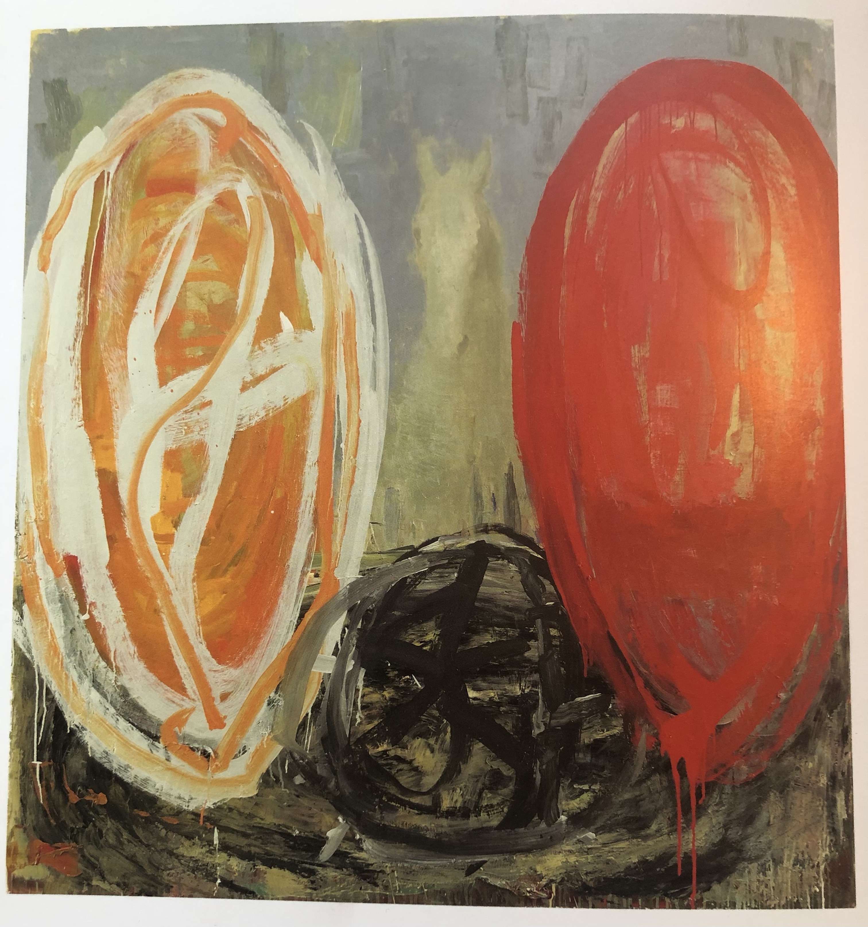
Le Brun, ‘Lyre’ ,2007
Le Brun, ‘Draw’, 2007

Christopher Le Brun’s work, similar to Basquait’s work in the sense that it’s loose, also encouraged me to work light heartedly and influenced the vigorous orange and red’s, contrasted by the white, that began to emerge from my experiments.

My study influenced by Christopher Le Brun’s use of colour and Basquait’s playfyl strokes, Charcoal, acrylic, pencil and ink
A second study influenced by Basquait and Le Brun, Acrylic, charcoal and pencil

Ekaterina Popova

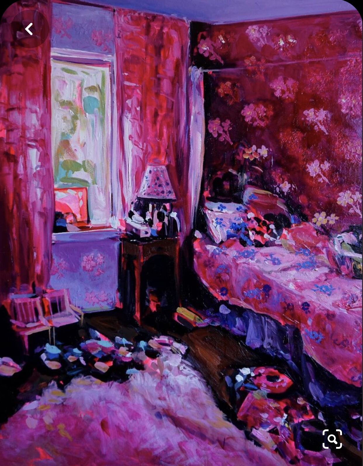
I am drawn to the traditional acrylic and oil works of Popova, a Russian artist, as her paintings of interiors are intimate, emotive and arouse feelings of nostalgia, but more than that a sort of presence that’s hard to describe with words. I’m in awe also, of the way she has cast a strong sense of light, catching on objects, whie using a vibrant pallet of pink, orange, red and purple tones.

Ekaterina Popova, ‘Sylvie’s Dream’
Ekaterina Popova
My Study influenced by Popova, using watercolour pencil, graphite and acrylic.

Here, (above) I have attempted to imitate Popova’s use of white, by applying the white paint on top of a dried wash of a vibrant orange ink, by dappling and blotting a coarse, brush. Note, I only used a very small amount of paint on my brush which, combined with the coarse hairs has allowed highlights of the ink wash to show up from below. Through doing this, I have achieved the rustic buttery white strokes that Popova uses.

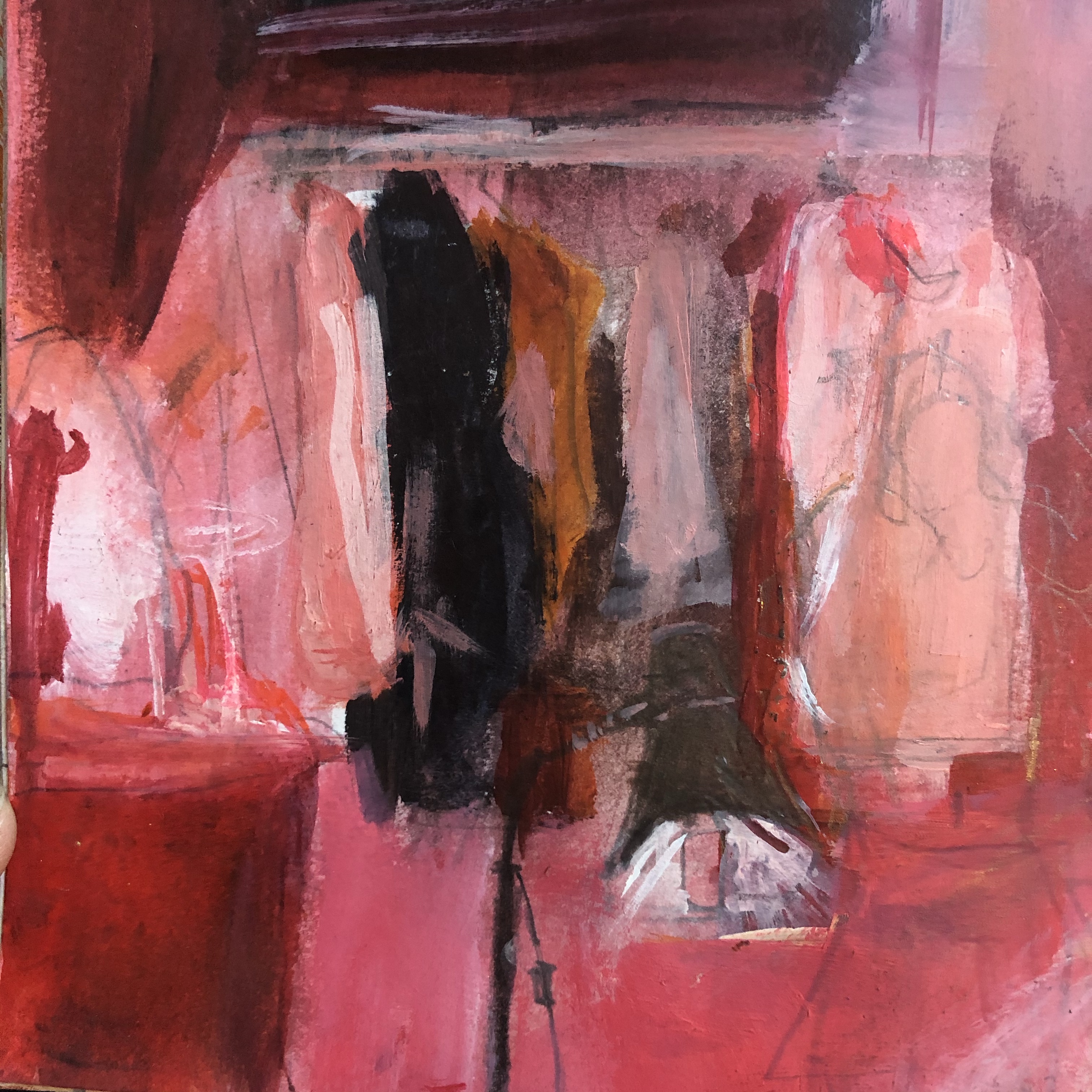
Another study inspired by Popova, using ink, pencil , watercolour pencil and acrylic.

Here I included darker areas to contrast the light, like Popova does in many of her paintings. I would say that the left side of the study succesfylly suggests an illuminative light source, which I tried to carry through the rest of the study e.g it the white highlights subtly move accros from the left catch on the hanging clothes, and on to the rug in the center.

Ekaterina Popova
A close up of the clothes from the previous study I made, where I attempted to replicate techniques Popova has used in her painting of hanging clothes.
Ekaterina Popova
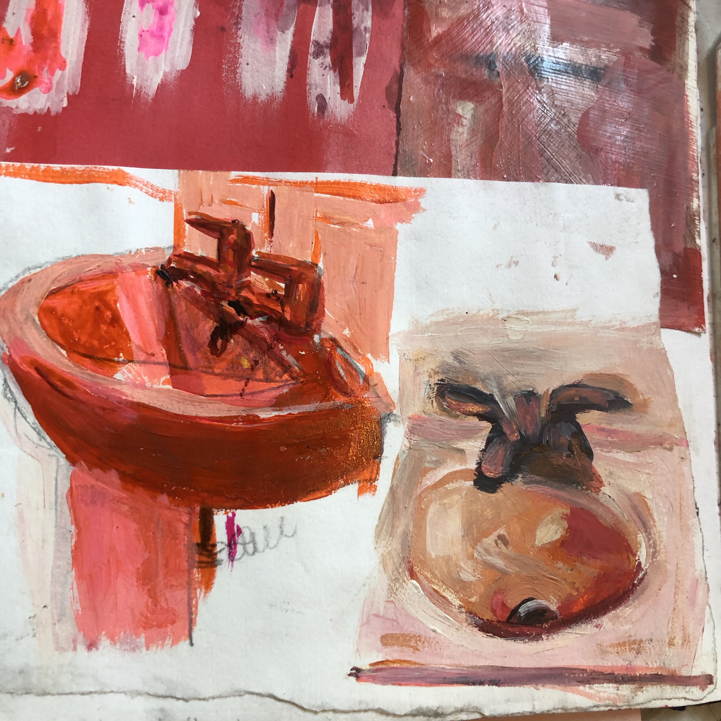
A study of sinks using acrylic and ink.: right, a more exact copy of Popova’s work, (using a slightly different pallet as I’d like to refrain from using too much pink in my work), left: own study of my bathroom sink using Popova’s technique.

Bryant Giles

Giles layers and collaborates his articulate drawings/ paintings to create one big conversational piece. Each piece seems to tell a story as my eyes scan across the piece and the many different lines and angles, along with Giles’ choice to leave areas uncoloured, creates a striking piece filled with mystery and commotion.

Bryant Giles

Bryant Giles

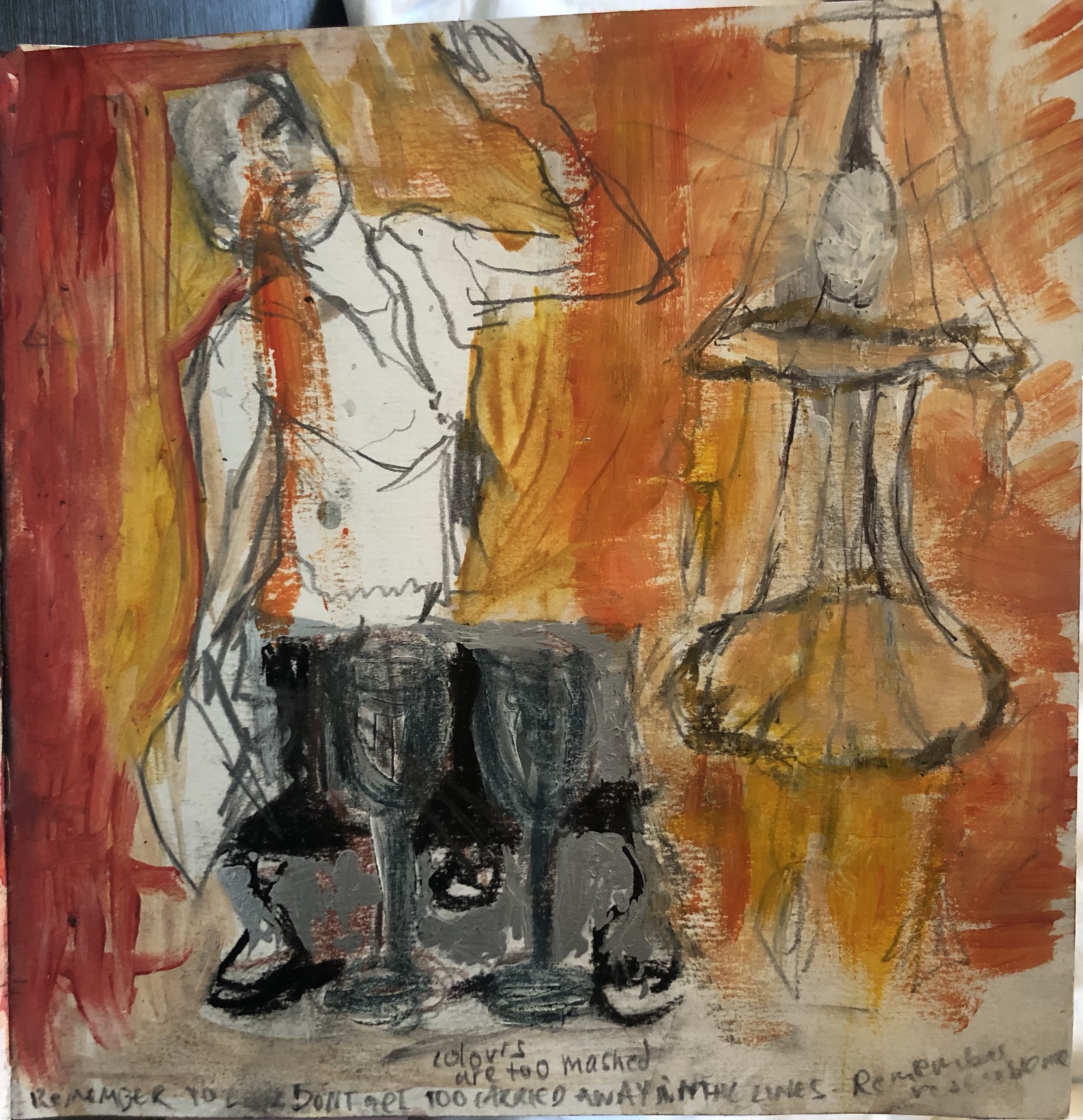
Like Giles, I want to create a little commotion within my own painting and so I made some loose drawings of my own, inspired by his works. Working like this really helped me generate ideas for I was able to work quickly and I found I created quite expressive lines like his, through using soft coloured pencils, and dark graphite.

Close up of a drawing I made using soft coloured pencils and a soft graphite, inspired by Bryant Giles.
Another study in coloured pencil and graphite inspired by Giles
Pastel, graphite and coloured pencil, inspired by Giles

Michael Andrews

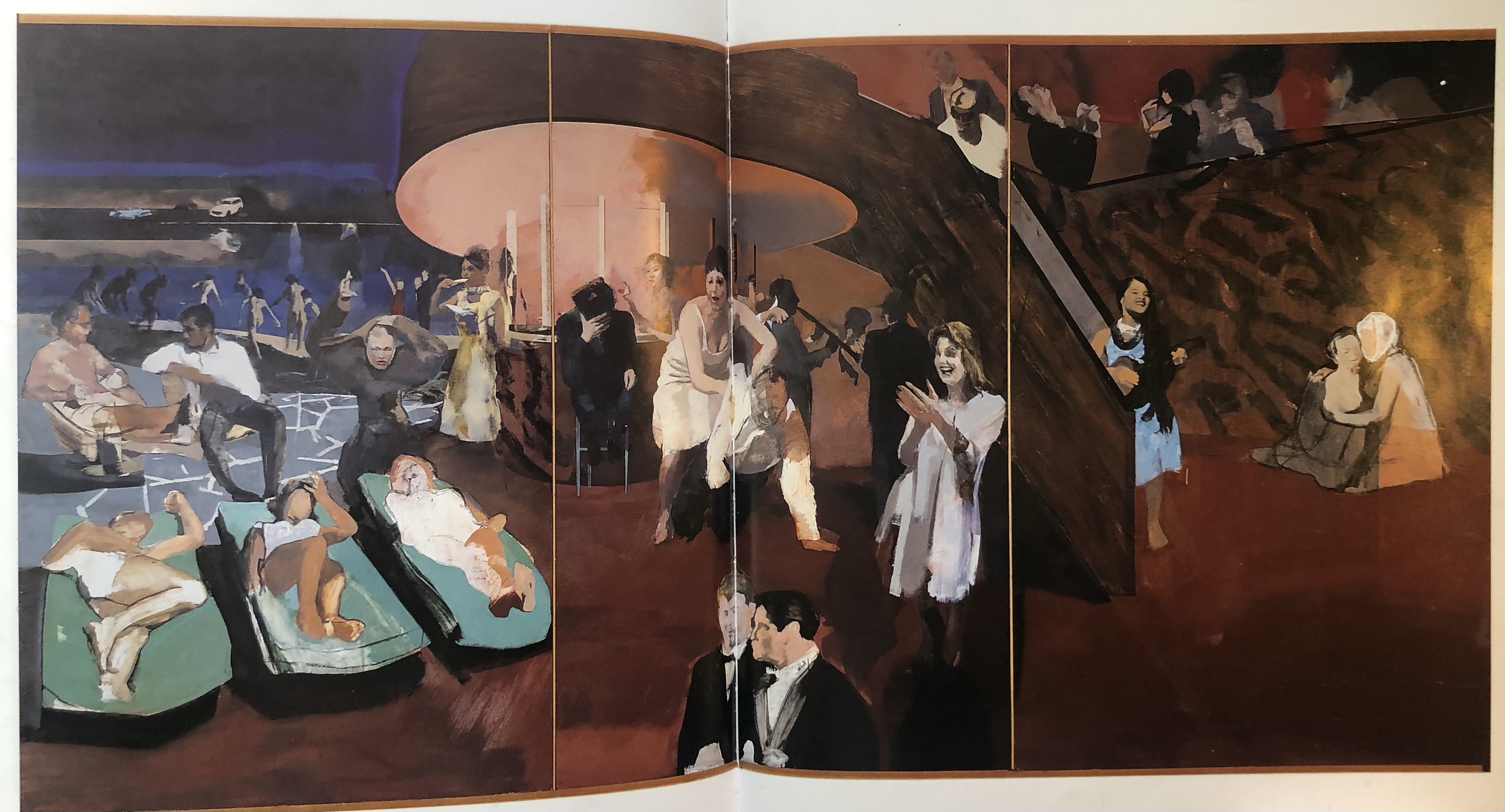
I really feel a strong attachment to Michael Andrews piece ‘All Night Long’. It displays the glowing, rich atmosphere found amongst a party of people and soi have made experiments from this piece, through which really began to help my work develop strongly.

Michael Andrews, ‘All Night Long’, 1963-4, oil on composition board

The two studies I have shown below have been made using the rich colours that Andrew’s has used within his piece. The painted figure (first study, left) was heavily influenced by the suggestive brush strokes he uses within his own figures as I like the movement he suggests amongst his figures by painting them in this fluid manner.

Studies inspired by Andrews’ piece, made using acrylic, chalk, graphite and charcoal.
Study inspired by Andrews’ piece, made using chalk, charcoal and graphite

In the next two studies (below) I concentrated on the tones Andrews has used and mimicked them in my own composition . For the first I used a combination of chalk, coloured pencil and oil pastel. These mediums allowed me to quickly grasp the tones and merge them together smoothly. I found they’re a great and effective combination of materials for making quick studies. For the second I used watercolour pencils, graphite and a little acrylic which I also found affective but a little slower for I had to allow it to dry.

Study inspired by Andrews made using oil pastel, coloured pencil and chalk

Study inspired by Andrews made using watercolour pencil, graphite and acrylic

Mixed Media Painting; (broad based theme)Self Portraiture

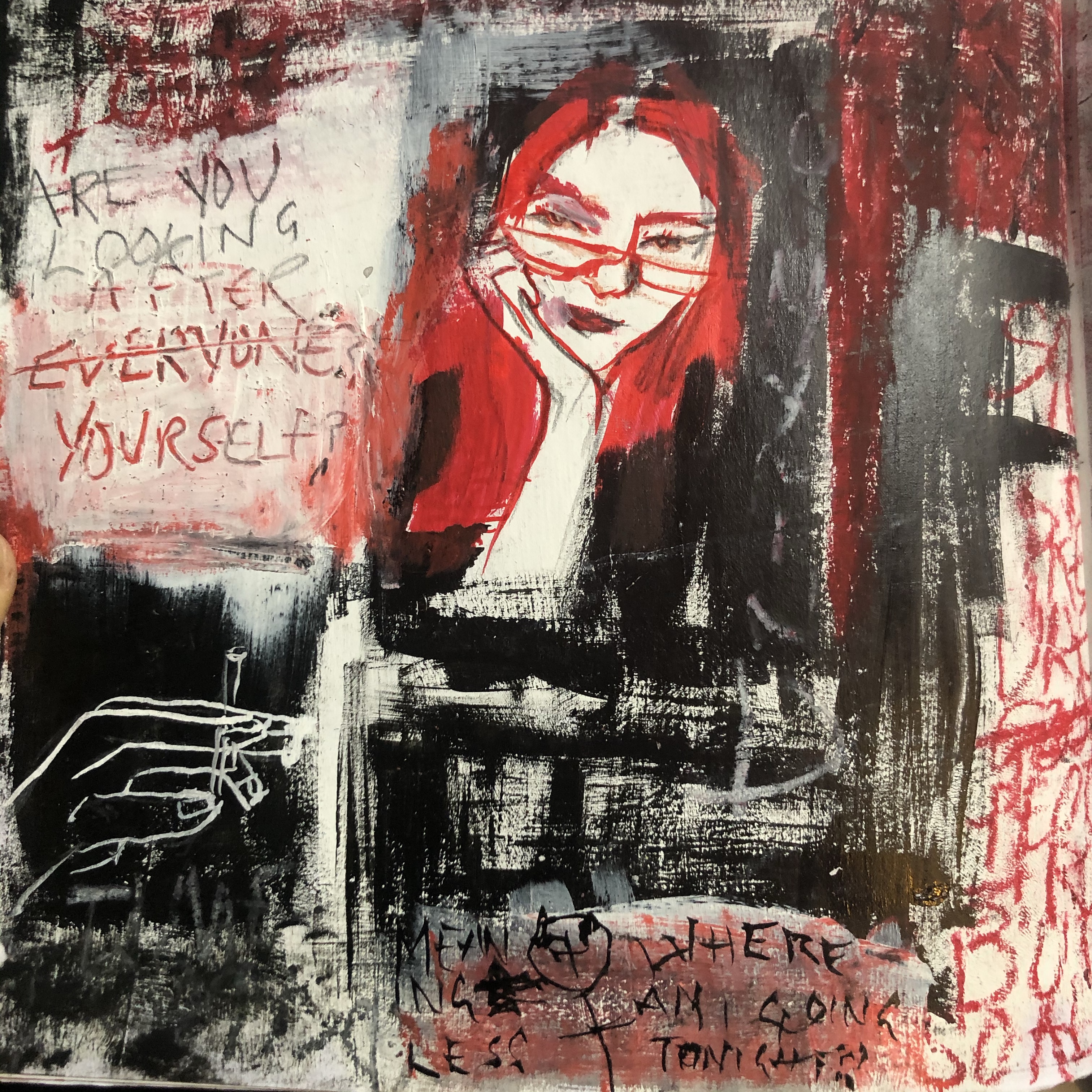
This block of mixed media painting workshops, led by Iwan Gwyn Parry, a practicing painter, was centred around a broad based ‘self portrait’ theme, where I produced a body of work that reflects my character, and important thoughts and events in my life.

As I began this work in September, it had been a strange time. Throughout lockdown I’d been reflecting lots in my own thoughts, reflecting and remembering parts of my life, and so when I was introduced to the theme I had plenty of ideas. Lockdown life had been a somewhat crazy, dreamy six months mainly spent in the company of a boy I’d met just before lockdown and he was whom I spent the majority of lockdown with. Most days we were out venturing in nature together and spending time in his shed smoking looking at art and listening to rappers, dubstep and the music he produced. We both shared creative mindsets and we were always conversing about mad, crazy ideas and thoughts and about artists lives . Around the time I began this body of work, I had just re-entered a structured, busy life again and things with the boy, who’d been my companion throughout the strange times, came to an end. I suppose I was a little overwhelmed by everything at the time- the adjustment to a routinely life again, interaction with lots of people again, I was feeling very strange and a little lost.

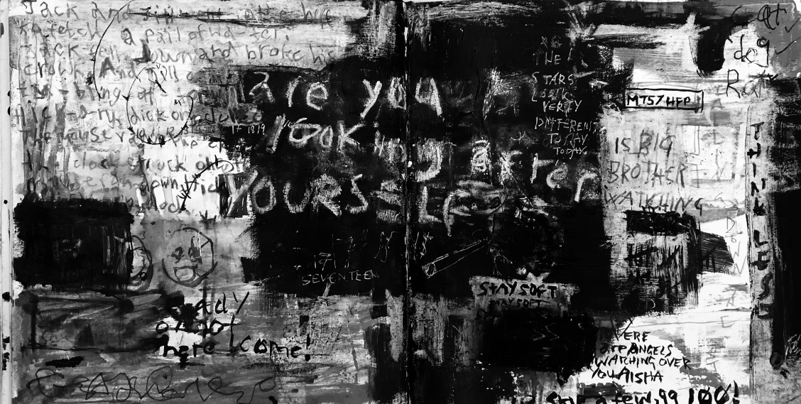
I discovered that red black and white best described these feelings I was succumb by. I have included many symbols and subtle messages within my work that are personal to me, ones I think only I can fully decipher, and this is what excited me while I was working. I felt as though I was confessing and explaining everything I needed to but without having to talk to people face to face. I found by explaining myself in this way, through my brush strokes, that I was given the reassurance, comfort and closure that I realised I needed, and this is why this body of work was a lot more than just an art college project, it felt like a journey of growing through raw exploration of my inner self.

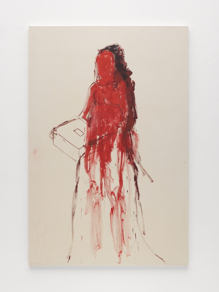
I was also comforted by three artists who’s work I found myself very much relating to and a great aid in strengthening my own practice. These three artists were Jean-Michel Basquait, Tracey Emin and Cy Twombly. All three use words and lettering very powerfully within their work, which I too wanted to use within my own work, as words to me, are, and have always been, very meaningful.

Below are some works by these three artists that I found to be most influential and that particularly stand out to me.

Cy Twombly, Venus, 1975, oil pastel, pencil and collage on paper
Cy Twombly, Coronation of Sesostris, 2000, acrylic, crayon and pencil on canvas
Cy Twombly, Untitled, 2005
Tracey Emin, Hurt Heart, 2015, Acrylic on canvas
Tracey Emin, I’m Walking Around My World, 2011, Polymer Gravure
Tracey Emin, I was too young to be carrying your Ashes, 2017-18
Tracey Emin, I need Art like I need God, 1998, pencil and ink
Jean-Michel Basquait, Per Capita, 1982
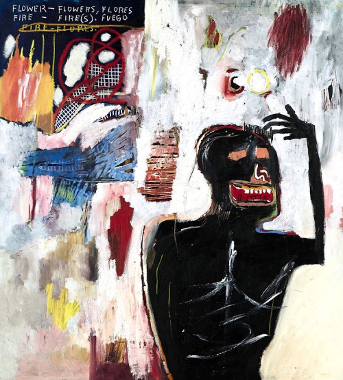
Jean-Michel Basquait, Fuego Flores, 1983
Jean-Michel Basquait, Untitled, 1981, Acrylic, oil stick, paper collage and spray paint on canvas
Jean- Michel Basquait, Untitled, Oil and oil stick on paper

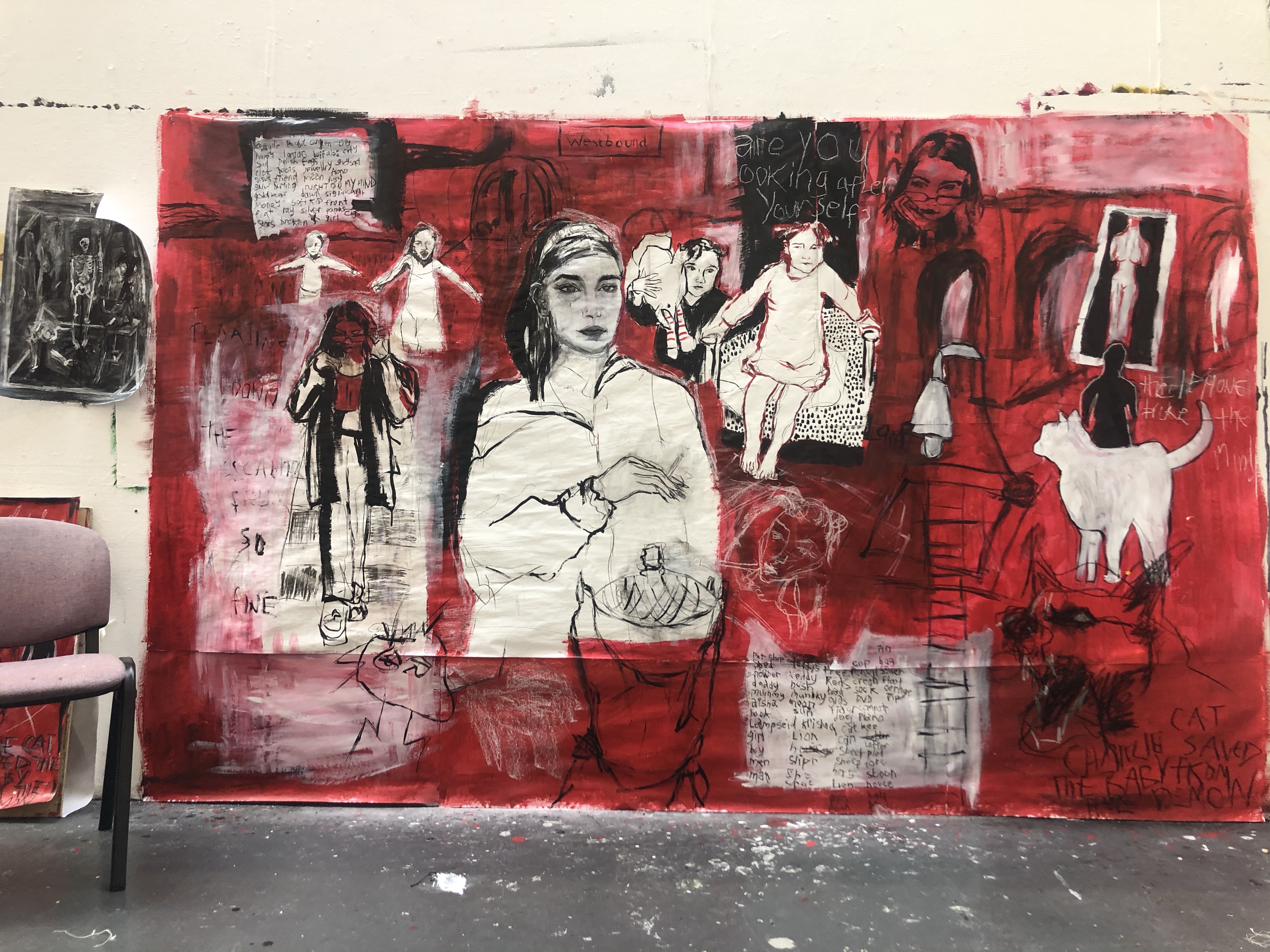
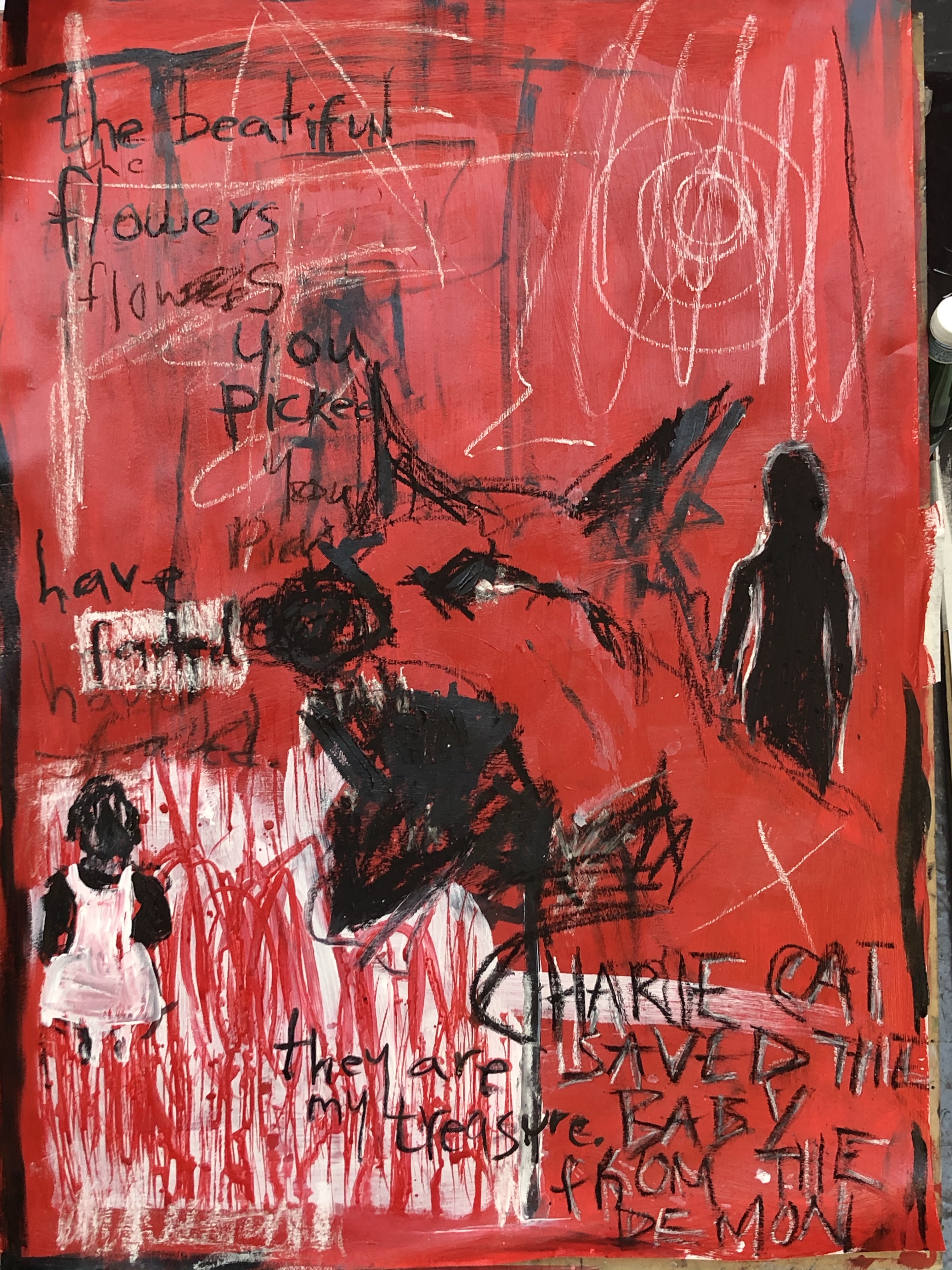
Below are images of my entire body of work completed for Iwan’s workshop’s (in order). I began the body of work by starting on the large scale piece, which I worked on throughout the five weeks, alongside which, I made studies in a sketchbook and A1 sheets.

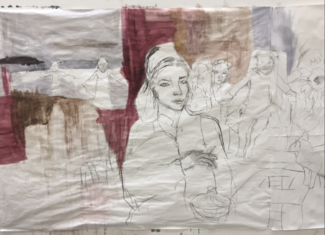
Initial plot drawn using charcoal and acrylic wash
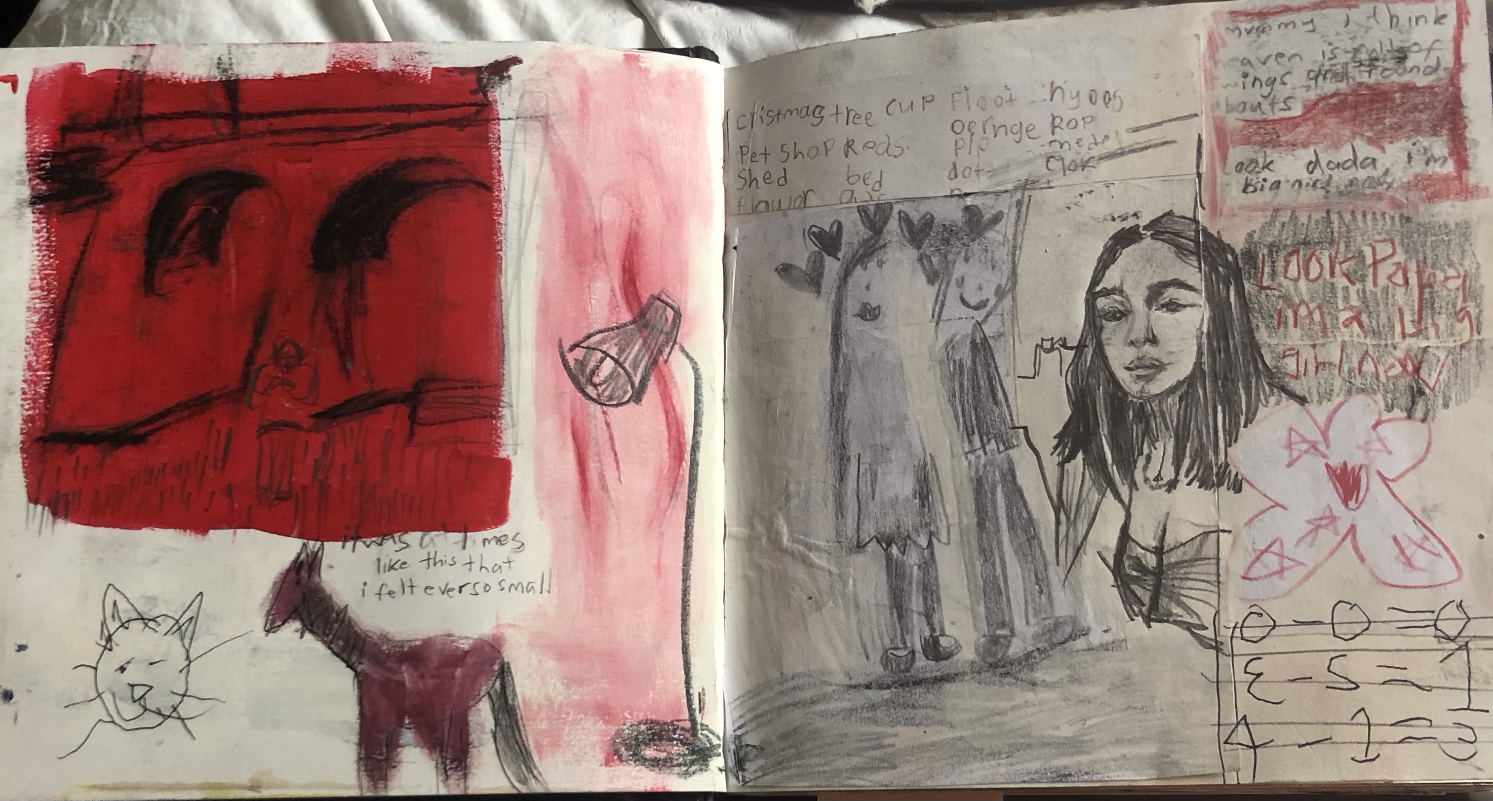
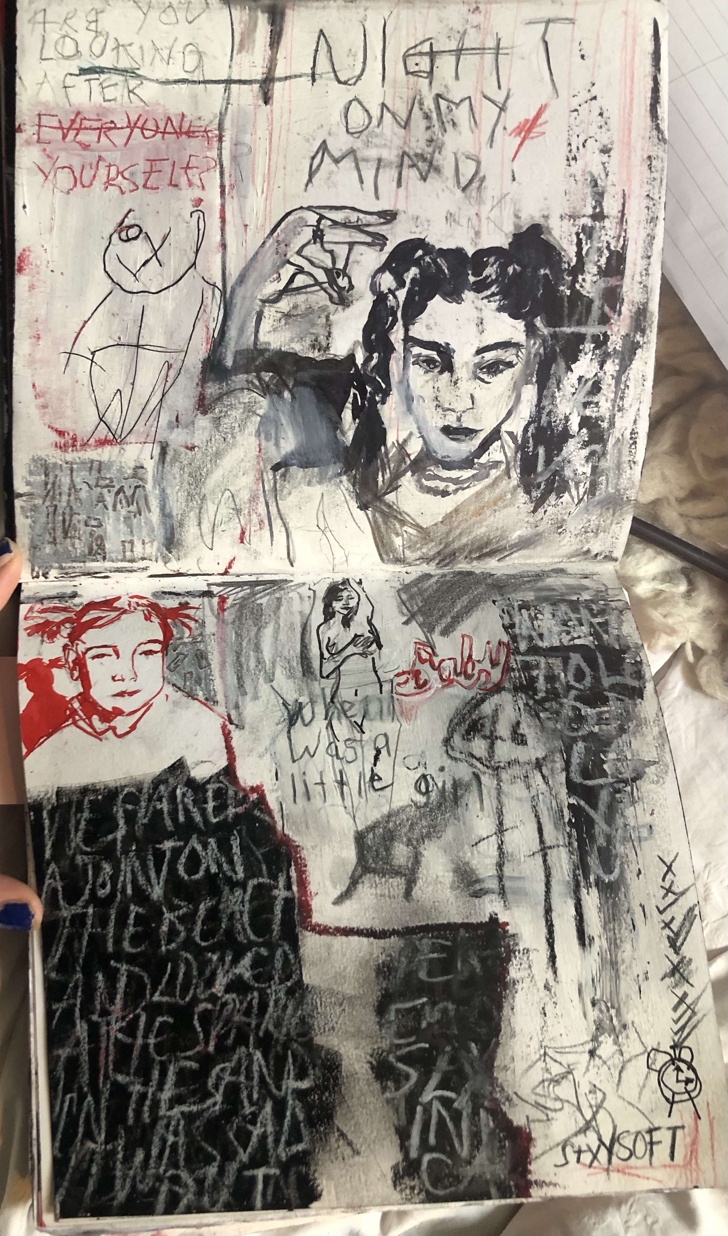
Sketchbook work , mixed media, where I developed my plan
Development of the large scale piece, discovered through sketchbook experimentation that I wanted to paint in red.
An A1 development study I made refining and choosing elements I wanted to include, in order to help the large scale piece progress.
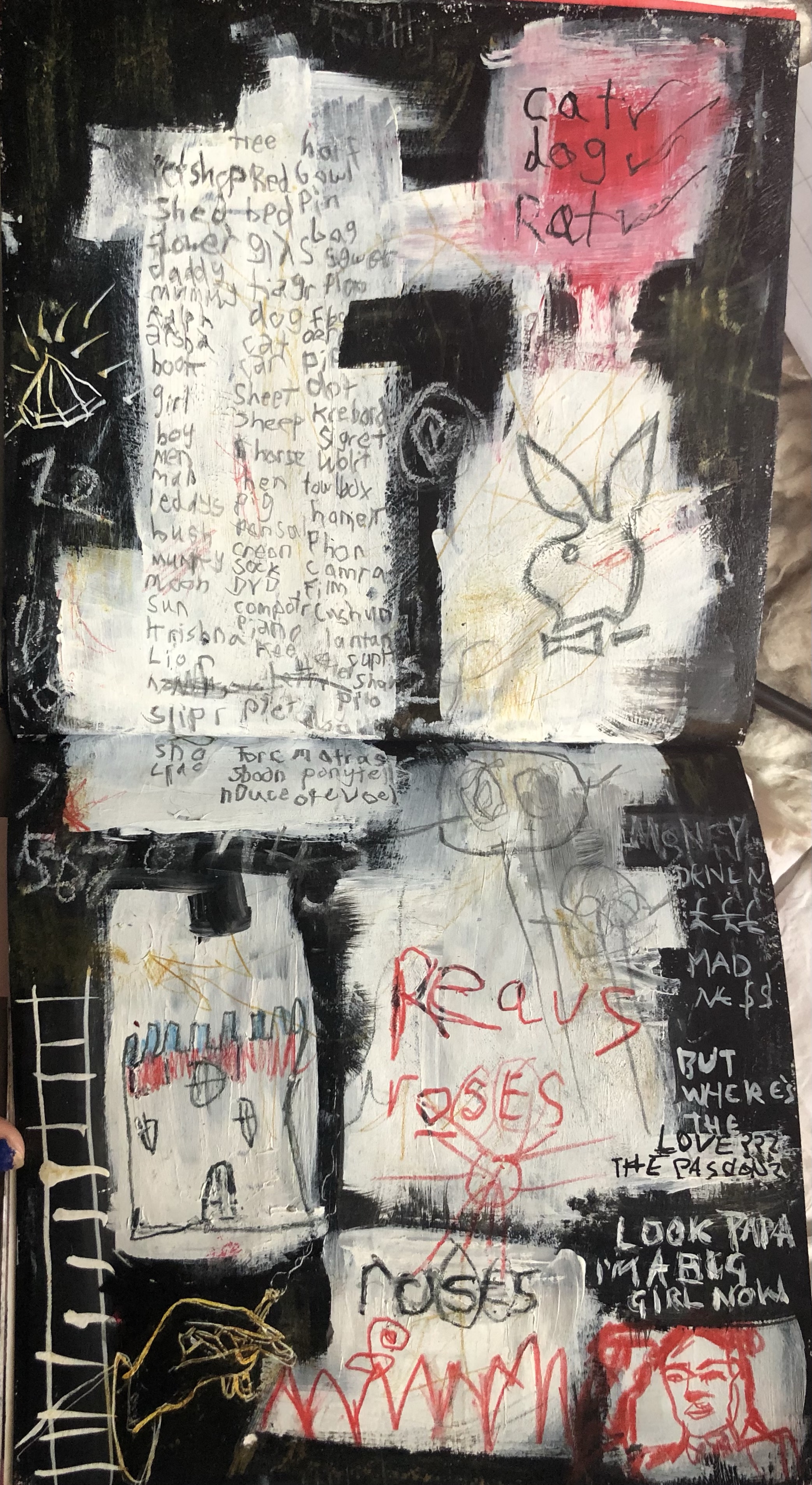
More mixed media sketchbook work to further progress the large scale piece.
A final A1 sheet further exploring elements I wanted to include in the large scale version, mixed media.
A study made in my sketchbook, mixed media, exploring lettering and numbers that I wished to include within the large scale piece.
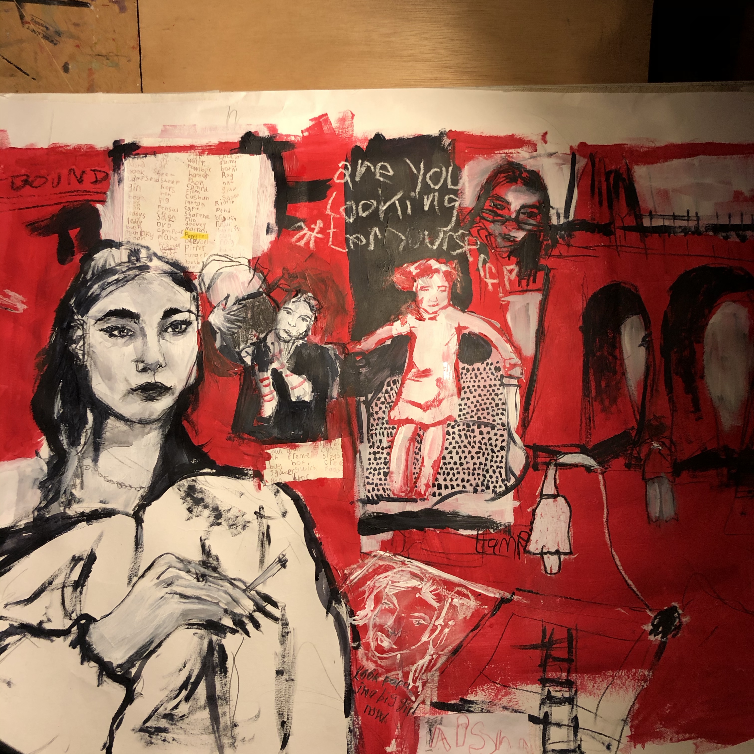
The mixed media large scale piece complete.
A developed study made from the complete large scale piece (A1), mixed media
Another A1 study made from the large scale piece, mixed media
A more refined replica of the A1 version (above) made in my sketchbook), mixed media
Developed mixed media study in sketchbook, made from the large scale piece.
Developed mixed media study in sketchbook, made from the large scale piece
Developed mixed media study in sketchbook, made from the large scale piece.

Overall I thoroughly enjoyed this block of work. I worked hard, yet it didn’t feel as though it was work for I enjoyed it so much. I learnt to work in a new way, prompted by my thoughts, reflections, powerful sentences I would construct, and emotions. It made me feel confident to be creating from my head, and it felt liberating to be creating work so personal, I discovered I was totally engrossed. I am extremely pleased with the collection of work as a whole, although I would say that I should have spent a little more time rendering the main portrait featured in the large scale piece. I would like to continue working in this way in the future – through using my mind as a muse.

Drawing in the Life room without a life model

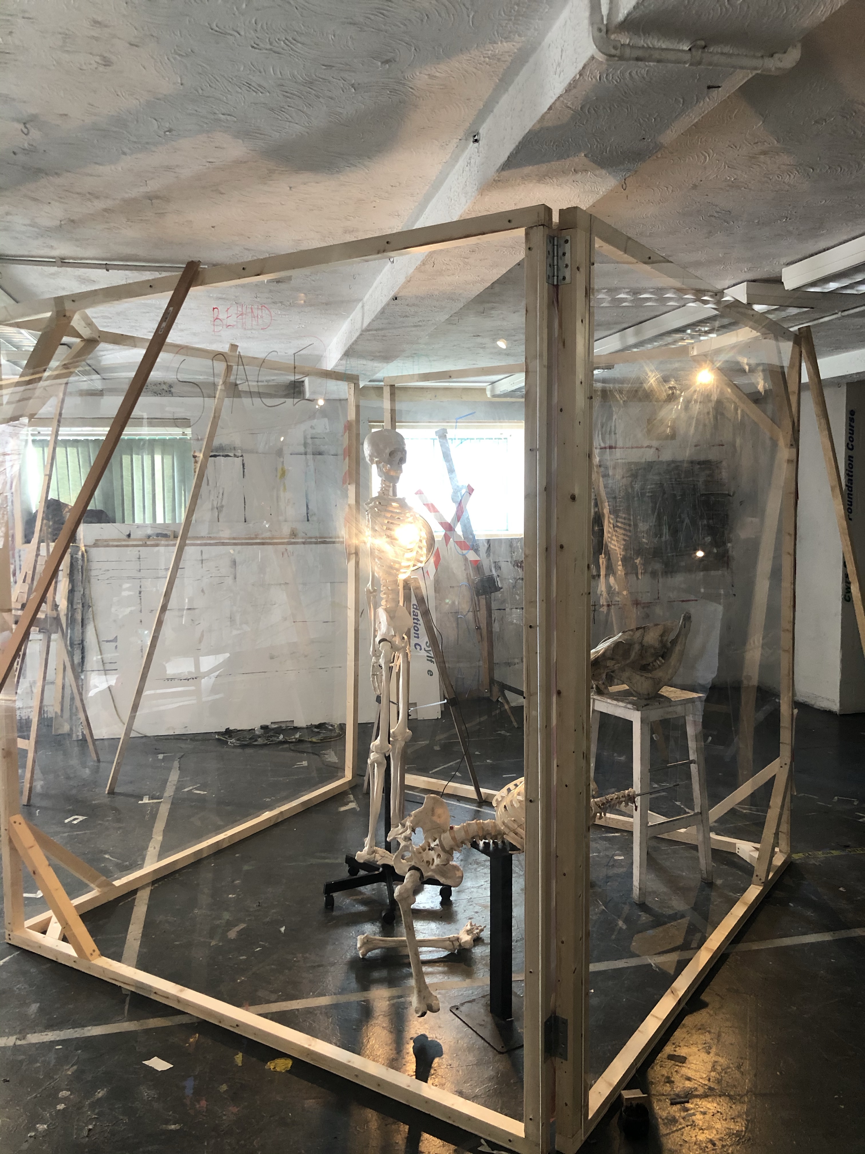
The life model is off due to fear of covid so this week I drew a skeleton in the set up of a perspex box that used to be what the life model posed in.

I was inspired to create this piece by my classmate Rowenna whom I walked in on painting abeautiful piece of this skeleton in the dark, lit only by a lamp. I had to work quickly as I didn’t have long enough to finish a rendered piece, but as my motivation was brimming and I was excited by the dark, lamplit environment and the stunning reflections across the perspex box, I worked with gusto and produced this piece below, and I think it may be may best piece of work I’ve produced in the life room so far.

I worked on this standing at an easel again. I have become fond of working at one, it now feels rather strange working at a desk – I much prefer the freedom of working upright- my arm has much more freedom to produce different strokes and I can see the piece as a whole more easily.

I drew all the elements with compressed charcoal, adding bits of white chalk ere and there to give myself a sense of light structure. I then covered most of the drawing with washes of black ink and compressed charcoal. I then reworked the highlights with white ink, and defined dark areas further with black acrylic. I wasn’t ever too preious about the piece at any point and played with it in q way, always maintaining a sense of fun and I think this shows through i’s loose but structured lines.
(The setup of the room only I shut the door and turned the main lights off)

Some Contemporary Textile Artists

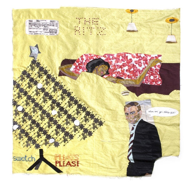
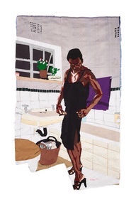
Billie Zawenga

Zawenga works through a process that begins with template drawings and fabric-cutting and ends with pinning and sewing. She quotes “I’m expressing myself and embracing my femininity through my choice of material, sewing is also very therapeutic and as a person who internalizes things, I find relief in it.”

What is most refreshing about her work is the way she uses chopped bits of fabric and fills them, it looks as though sections are missing, and therefore marks her works with a sense of wonder. I like how the artist uses the background to mold the elemnts within her pieces, specifically within the first( take the duvet for eaxmple). I also notice she uses many different segments of different shades of fabric to give skin tones of the figures form and shape- I would consider working this way if I was to deaw a figure with fabric. I’m also inspired by the use of writing in stich alongside the textile illustrations.


I admire the choice of colours Zawenga uses here they are rustic, and, combined with the jagged borders, the piece emotes insecurity and a sense of unsettlement.

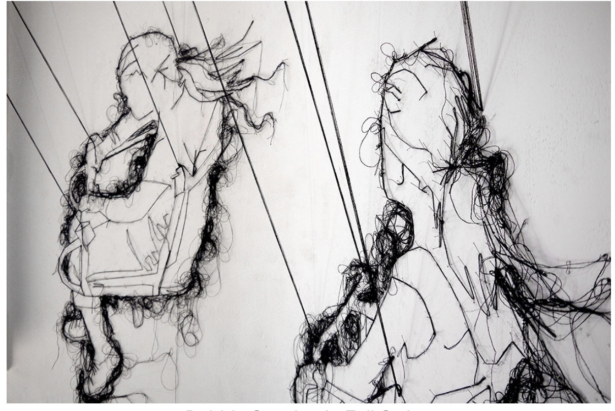
Harriet Popham

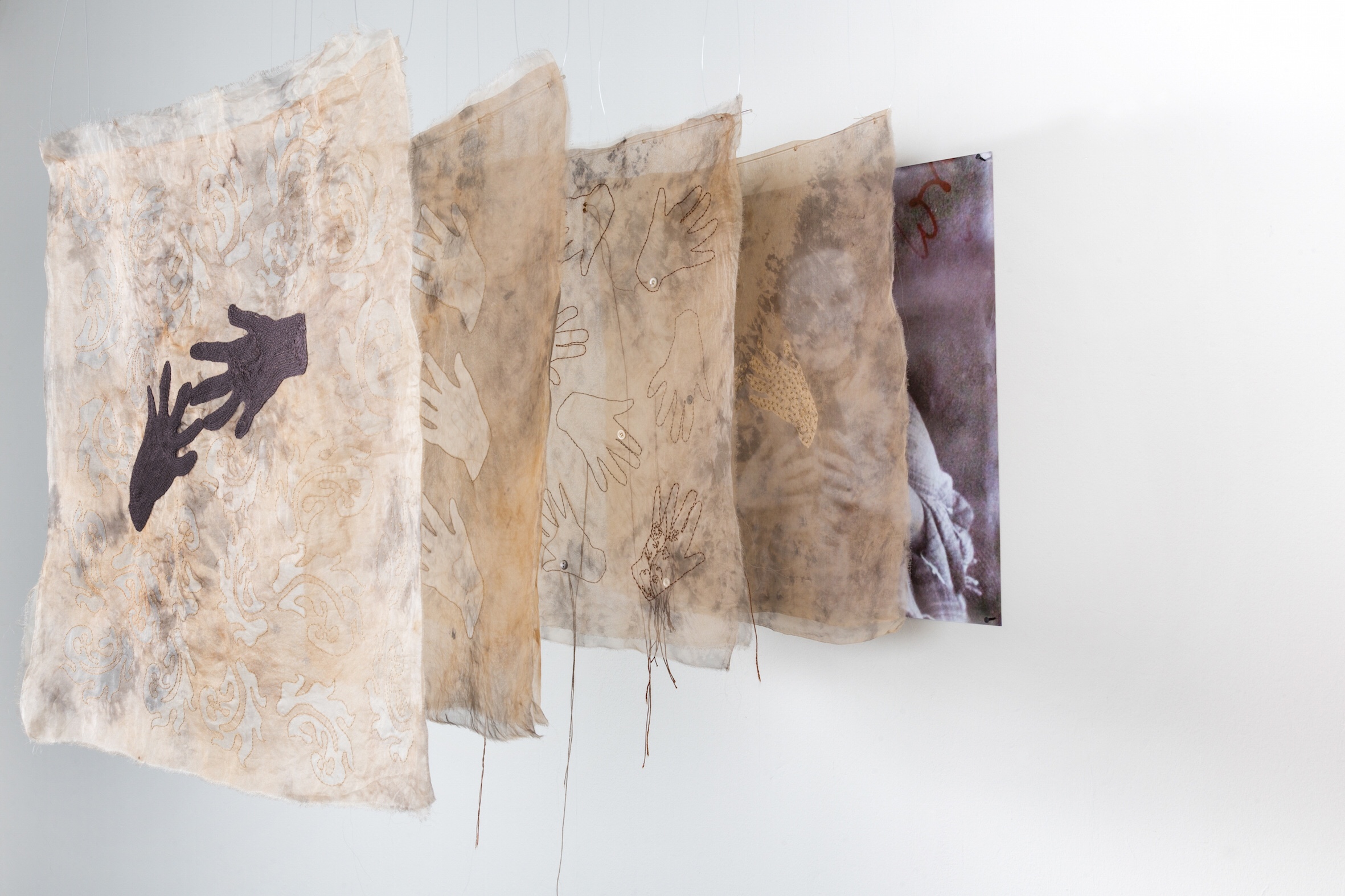
I’m captivated by the fluid, continuous lines of stitch that Harriet Popham drapes her work with and how she allows them to flow outside the boundaries of her subject. Through this technique she gives her subjects spirit and sense of impermanence.
Sarah Davidson

This collection by Sarah Davidson reminds me of old black and white televisions. Although I tend to work quite loosely and wildly I am fond of the rigidness and precision of this work, it almost creates illusions combined with the photographs and is an interesting way of working that I’d like to experiment with.
Lauren DiCioccio


Again, I was drawn to Lauren DiCioccio through her use of wondering lines of stitch. Here they give the work the notion that the piece may unravel, and therefor they look fragile. the subjects the artist has chosen are prestigious, it’s interesting that she chooses to represent them as fragile.

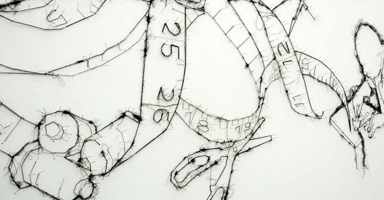
Debbie Smyth

Debbie Smyth’s playful, yet sophisticated contemporary textile pieces are a statement. Her artworks are created by stretching a network of threads between accurately plotted pins and she blurs the boundaries between fine art drawings and textile art, flat and 3D work, illustration and embroidery. I especially like the way she creates shadows with tangles of thread, and the spikes she uses to lift her drawings from their outlines. The combination of these many rigid lines of black thread along with the tangles and the curved lines, against the white is what makes these drawings appear so striking.

Contemporary Artists who use Trapunto and Applique Techniques

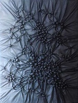
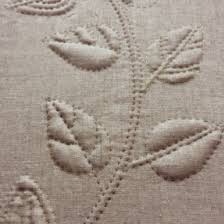
Ruth singer – trapunto

Ruth Singer explains that she revolves her work around ‘making with meaning’. I like the blue piece in particular as it seems to have depth, the raised tranpunto gets denser towards the centre which emotes frustration. The second piece is delicate, and the use of trapunto is interesting here for it’s carefully patterned to form the leaf shapes.

The use of applique here is strikingly bold on the front, it creates a strong impression and catches the eye instantaneously. The composition as a whole is full of subtleties that reveal themselves the longer you look, through the way Singer varies her use of applique and threads throughout each hanging.

Neroli Henderson – trapunto


These pieces by Neroli Henderson are also somewhat emotional they seem to have an air of melancholy, but also strength. The use of trapunto in the figures enhance the shape of the body and make them lifelike. She combines many different patterns through use of tranpunto., creating textured and intriguing surfaces. I like the way the artist draws into the background with the use of trapunto also, as it creates sense of space.

Sarah Walton – appliqué


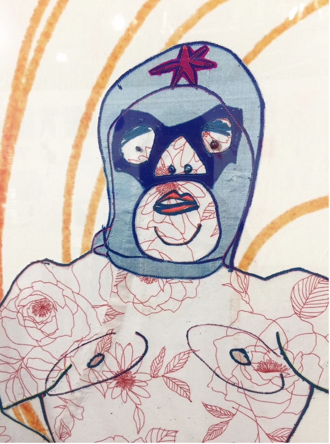
Sarah Walton uses a combination of machine stitch and applique. These methods work well together for the applique gives the raw, flowing illustrations a sense of solidarity, and as she uses patterned cloth the pieces are given a sense of refinement and detail . As the artist leaves the background empty and so her pieces convey a sense of animosity.

James fox – reverse applique

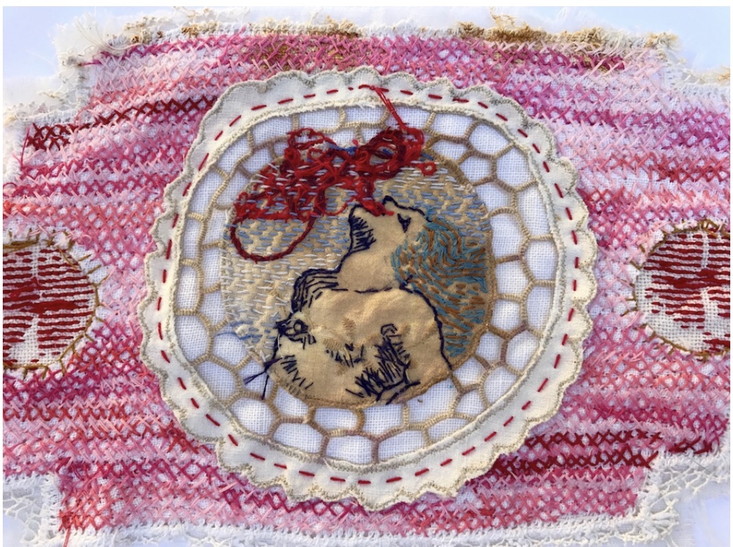
I notice that James Fox uses colours repeatedly in a pattern which lends each piece balance, he uses many different fragments of material in reverse applique and so from afar his pieces are elaborate. I specifically like the loose threads across the portrait for they break the refined structure of the piece, and give it a sense of freedom and unrestraint.

Sue Stone – appliqué

I like how the artist layers within her pieces using applique, especially in the portrait piece for her figures really come forth and possess a life like quality. I notice that she has thought carefully about the placement of shapes and space for it is even throughout both pieces, for example the circular clock is contrasted by the rectangular chequered background and the heads of the figures are laying against a background of vertical and horizontal lines. Stone has chosen a placid pallet that doesn’t detract from her subjects, with glimpses of brighter colours to stop the images from veering towards looking bland. Personally I’d say her works hold an air of despondence, perhaps something to do with her choice of subjects which appear very mundane.

Rachel Howard – appliqué

This piece by Rachel Howard stands out to me for the shapes and lines are constructed in a loose way which I’ve found is hard to obtain through the medium of sewing and is a way in which I like to work. I like too, that the artist has used a floral cloth for the skin tone of the figure, using patterns for a skin tone is a good way of hinting at the character of a figure and is perhaps something I’d like to include in my own works.

Willemien de Villiers -appliqué

Willemien de Villiers’ works are intricate and combine different shapes. Much like James Fox’s work, Villers work too, is balanced through the distribution of colour throughout each piece. The careful intricacy ensures each piece is full of depth and the careful patterns hint at subtle meanings that the artist wishes to tease us with. I am particularly fascinated by the stitching the artist uses on op of the applique within the last piece as it enhances the applique and really brings forth the surface.

Design a site like this with WordPress.com
Get started